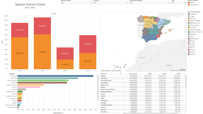
Data visualisation is a core skill in any data scientist’s arsenal. The volume of data generated in any enterprise is enormous, and making timely executive decisions relies on having all the relevant data and most current analysis available at your fingertips. In many organisations, this critical task of data presentation is done through the use of automated dashboards, such as with Power BI or Tableau. Provided the source data is updated regularly, these visualisation tools will automatically generate the required graphs and plots for whatever metrics need tracking.
Dashboards are an example of an integrated narrative approach to data visualisation — the user is encouraged to explore the data for themselves, and gather insights for their own purposes. These types of visualisations allow viewers to study the data and discover key insights on their own. Business intelligence applications like Power BI and Tableau are prime examples of this form of storytelling, where interactive dashboards allow the viewer to dive into the data with minimal guidance.
To read more on narrative visualisation and the different types of narrative approaches in data analysis, you can read my article below on using data to create narratives for presentations:
In this article, I want to run through three examples of data visualisations I created using Tableau Public. Tableau Public is a free service for anyone who wants to create their own interactive dashboards — with the caveat that all visualisations generated are publicly accessible (a licensed version of the application is also available, which would be more suitable for confidential data). I’ve included links to all the dashboards I’ve generated here if you’d like to explore the data in your own time.

Be the first to comment