

Doing an analysis of your sales and production gives you a unique insight into the strengths and weaknesses of your company’s sales and production teams. This type of analysis is vital for finding weak spots and bottlenecks in your processes, so you can improve on them.
It is important that you use the available data in your business and take advantage of reporting tools like Power BI to make better business decisions and achieve data-driven success.
However, the prospect of sifting through the many data you have and trying to make sense of it all can be overwhelming. Knowing what to do with the information you have is the first step.
The second step is checking out the Enterprise DNA Showcase. This is a great place to start if you’ve been scouring the internet for quite some time for report and dashboard ideas. Our online library of reports covers multiple functions and industries.
By using our Showcase page, you will spend less time building a report from scratch, and more time making strategic business decisions that will benefit your company in the long run. Check out the latest batch of reports we’ve added in our Showcase collection. These reports were the handpicked winners from the recently concluded Power BI Challenge 20. If you want your report to be part of our Showcase, make sure to join Power BI Challenge 21 for the chance to be featured!
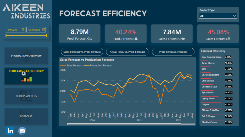
Sales and Production Analysis Report
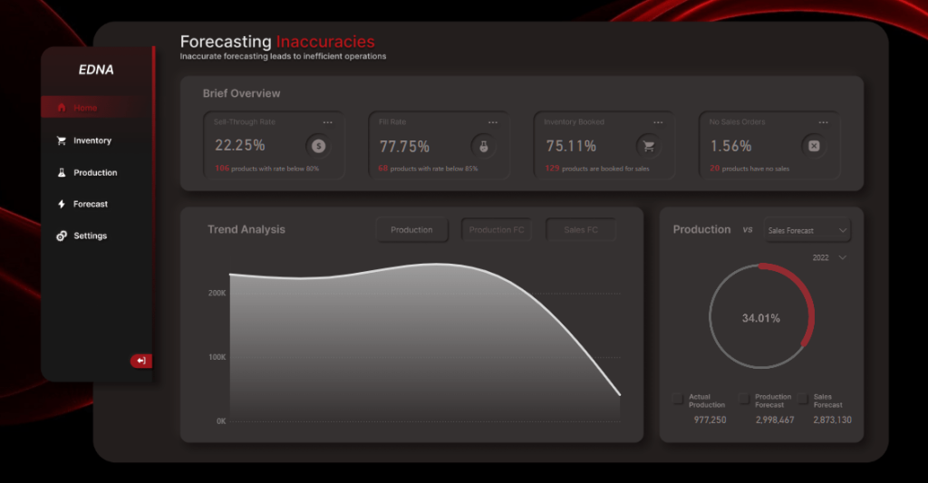
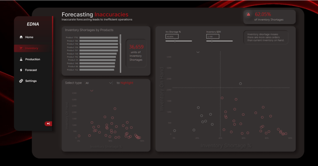
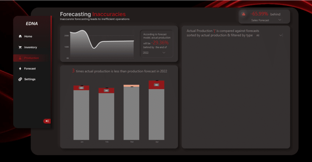
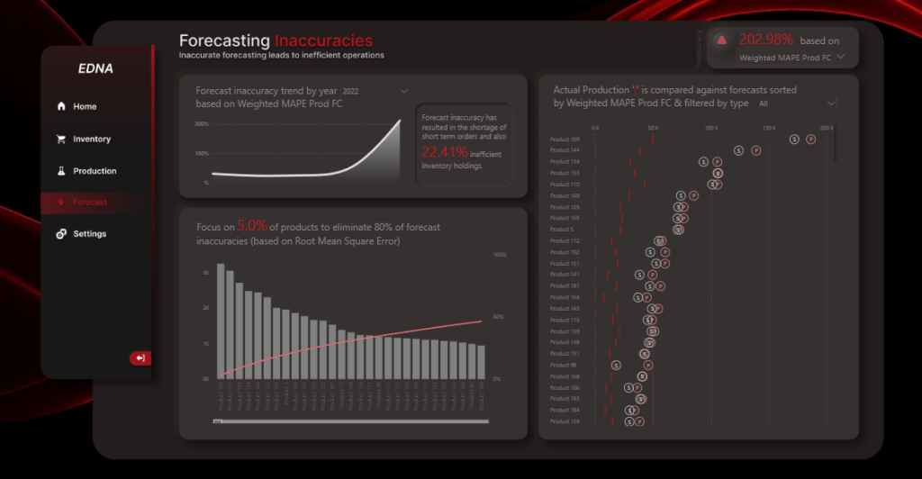
This Coca-Cola inspired report created by Team JMAP highlights forecast inaccuracies using Deneb visuals, bookmarks, and navigation. JMAP is a collaboration among Enterprise DNA experts Brian Julius, Jarrett Moore, Mudassir Ali, and Greg Philps.
On a side note, we highly encourage the Power BI Challenge participants to try to work on a challenge within a team environment – just like what the JMAP team did – to further enhance the development experience and to promote collaboration among fellow data analysts.
Sales and Production Analytics
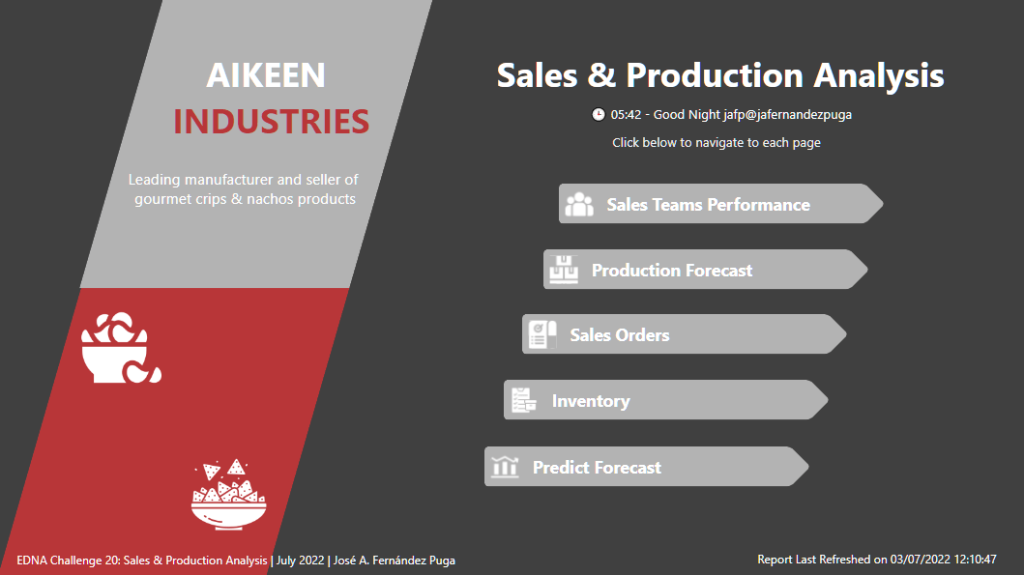
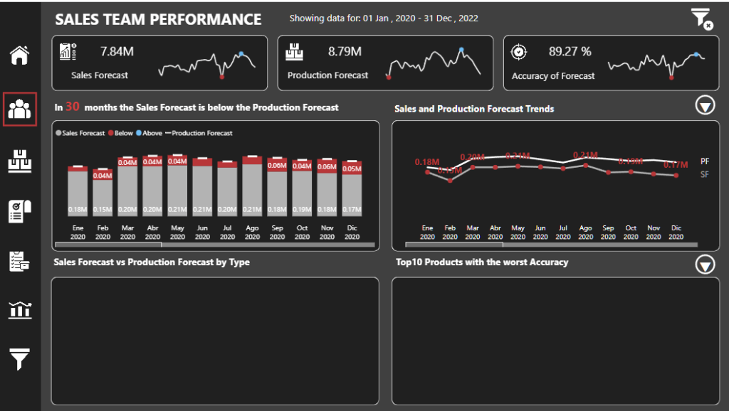
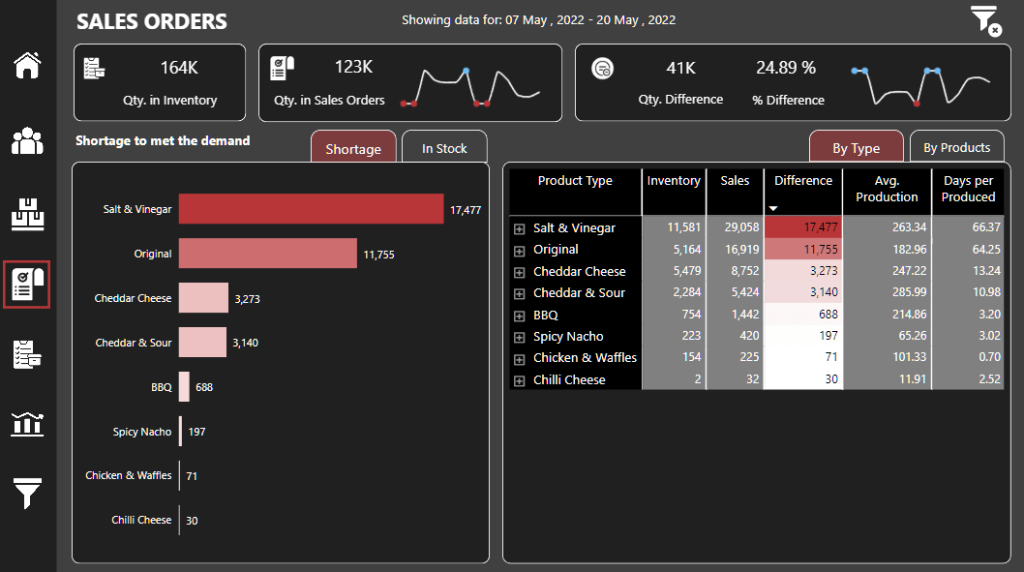
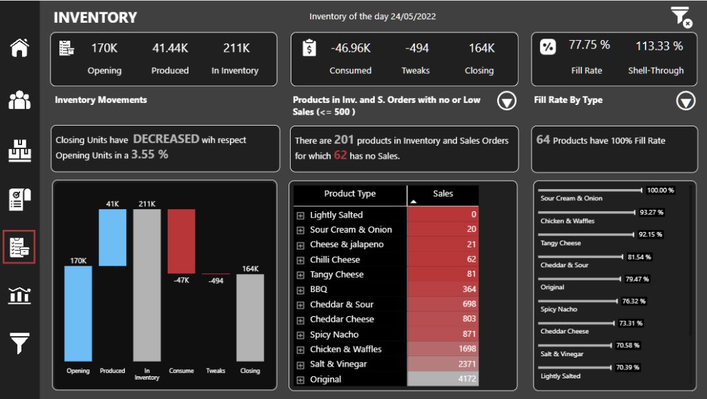
This well-executed report created by Jose Fernandez Puga makes use of an attractive dark-mode theme and incorporates the use of tooltips, dynamic text, and a variety of visual types to address the key questions presented in the Power BI Challenge.
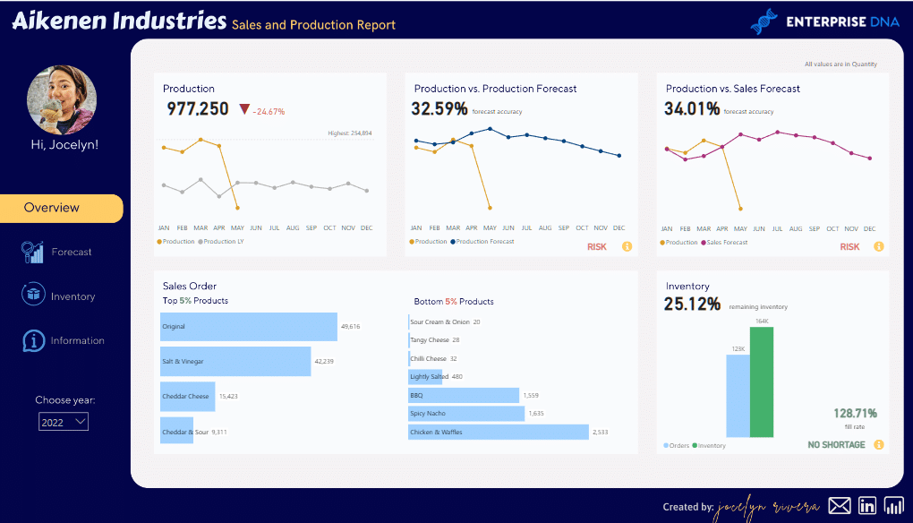
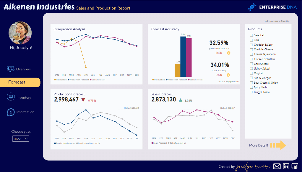
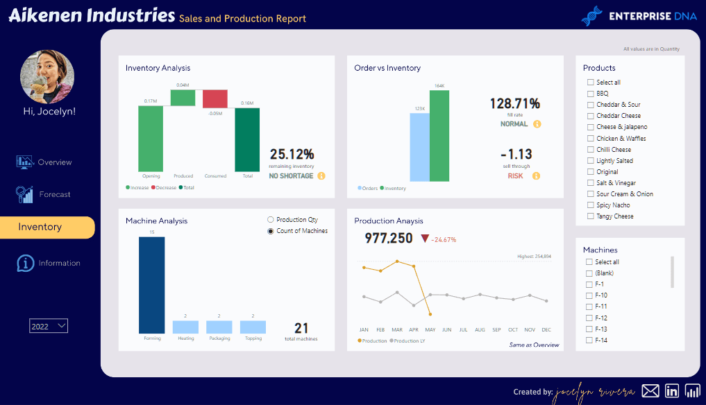
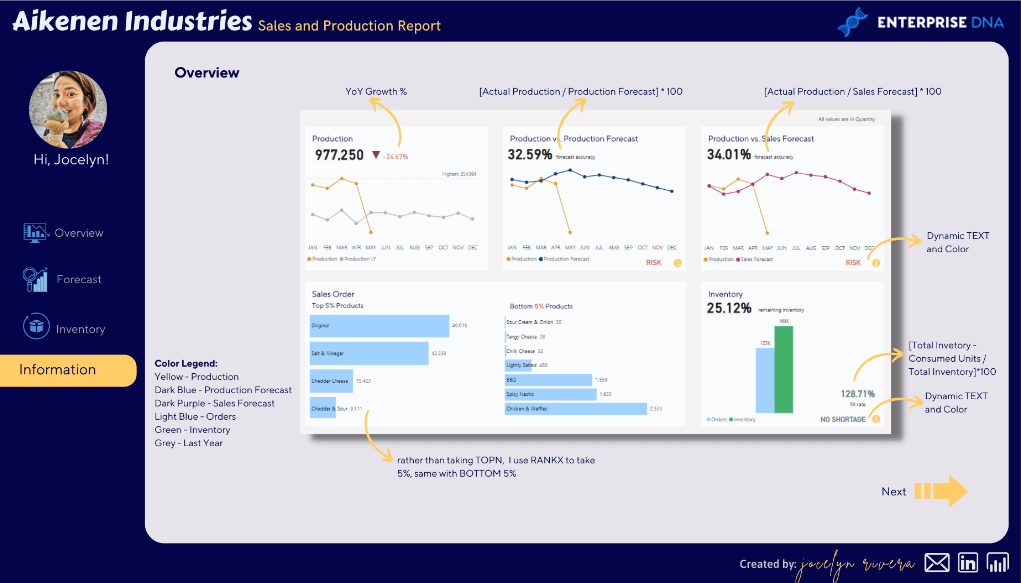
Sales and Production Report
This concise report done by Jocelyn Rivera has excellent UX and outstanding use of color to convey key findings, as well as an innovative information/help page.
According to Jocelyn, she created this report with the intention that it can be reused in the future. She came up with a simple one-page presentation that contains all the things that will be discussed during a meeting or call.
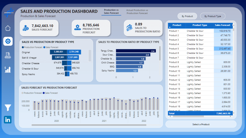
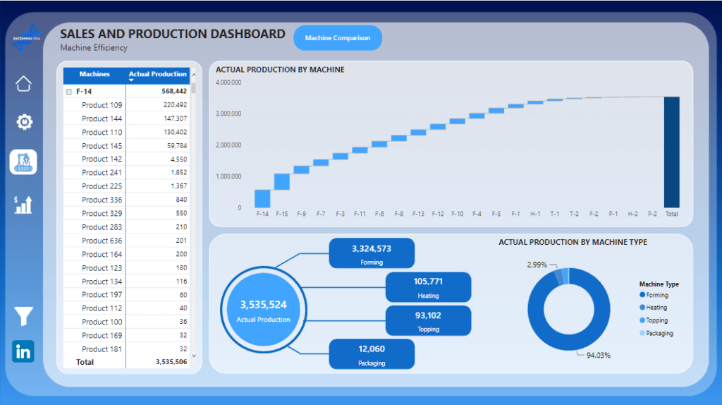
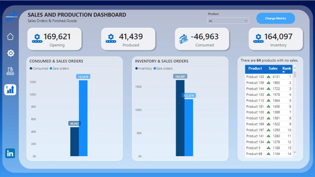
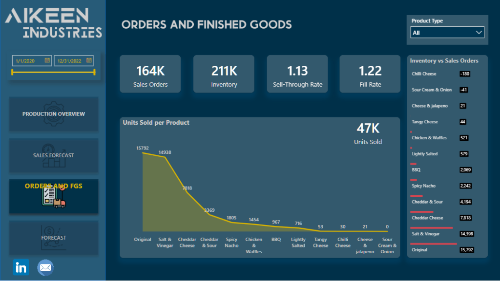
Sales and Production Dashboard
Camilo Corrales’ report is another standout because it is easy to navigate and makes good use of icons and native visuals. Camilo created a report that attempted to solve every single question that the end user might have about the dataset, and also incorporated multiple techniques to make it more interactive, such as multiple bookmarks and drillthroughs.

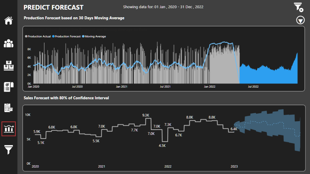
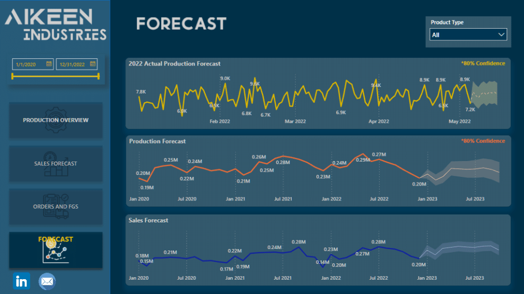
Sales and Production Forecast
Jonathan van de Waard?’s unique report focused on actionable recommendations that effectively use extensive text and well-chosen visuals to address key analytical questions.
Rather than just showing the insights, Jonathan added explanatory narrative to the visuals to provide context and some high level interpretation of these insights.

Sales and Production Insights
Jenelyn Rosales‘ well-designed report was built on best design practices, leading to a smooth and intuitive user experience.
The Power BI Showcase
We can’t wait to see how much learning our members can get from these new reports. Aside from these sales and production analyses, there’s a host of other reports you can check out. Simply visit our Showcase page and filter according to your industry, function, and scenario.
Once you see a report you like, you can download the PBIX file and play around with it so you can figure out how it was put together, and how it was delivered in a dynamic and easy-to-understand format.
The reports in our Power BI Showcase will help beginners and professionals master their ability to create functional yet appealing reports and dashboards. By working on these reports, we’re hoping that you can gain a deeper understanding of how you can leverage Power BI for a data-driven approach regardless of your industry or job function.
The Power BI Showcase is just one of the many things that add great value to an Enterprise DNA membership. If you want to download the PBIX file for any of the featured reports above, now is the best time to upgrade to On-Demand.
All the best,
Enterprise DNA Team
Be the first to comment