Welcome back to
this week’s edition of the Power BI blog series. This week, we look at controlling and
customising labels on Azure maps.
Power BI has just
introduced two key features to help you customise your Azure Maps visualisation
to better suit your needs.
Controlling Data
Labels in the Base Map
You can now decide
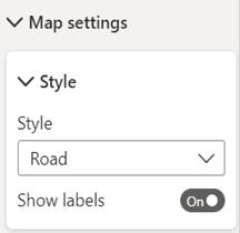
if you want to show or hide labels on your Azure map. You’ll find the new ‘Show labels’ toggle in
the ‘Map settings’ card of the Formatting pane:

If you toggle the
labels off, the map will not show any labels on the base map to give you a
clean map. This removes distractions for
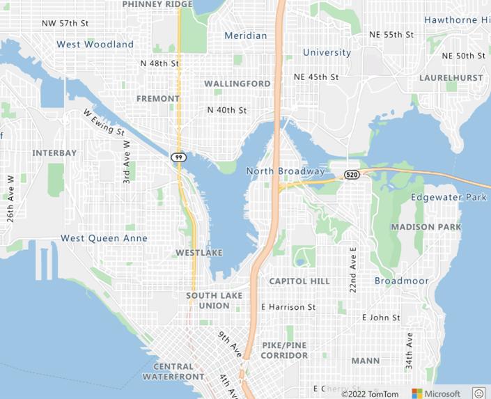
situations where the labels are not required to interpret the data shown. For example, here is what the map of part of
Seatle looks like with labels on:

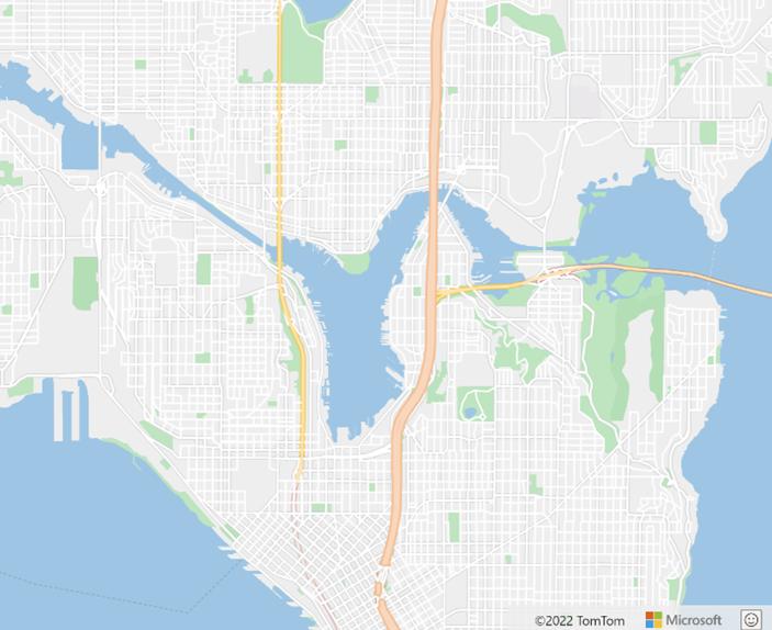
and here is the
same map with the labels excluded:

Customisable
Category Labels
In addition to
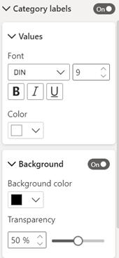
turning off labels on the base map, you can now customise Category labels on
your map as well. You’ll find these
options in the ‘Category labels’ card in the Format pane.


Be the first to comment