

Welcome back to
this week’s edition of the Power BI blog series. This week, we complete
our custom visual by creating the label measures, and constructing the chart .
Power
BI visuals are an excellent tool when it comes to telling stories with our
data.When we are analysing quantitative
data, we often need to compare percentage differences.The most common example of this would probably
be, “How much did the stock change today?”.However, how do we highlight that percentage change on a Power BI
visual, e.g. on a stock price
Line chart?
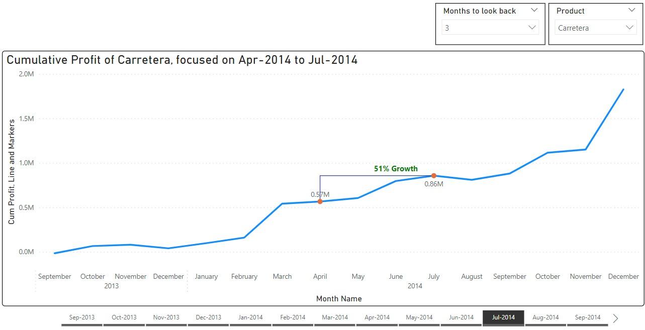
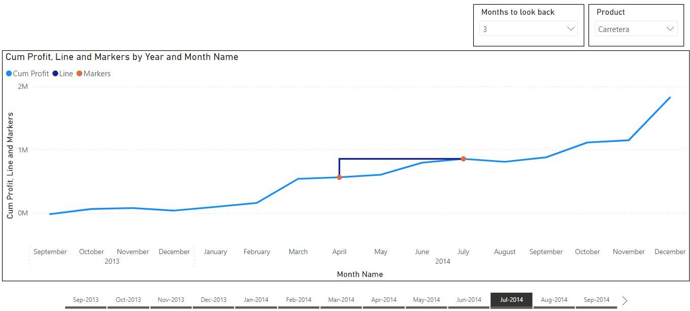
Above, we have created a custom visual to show cumulative profit, focussing on a specified interval. We have created a label to display the growth of cumulative profit and the current selection is from April to July. We can change the interval shown, by choosing an end month, and then specifying how many months to look back. The visual will not only display a label showing the growth, but it will also change colour automatically depending on whether the growth is positive or negative!
We will be using the Financials sample dataset in Power BI Desktop, and you can download our demonstration file with this link.
In Part 1 we prepared to
create our visual by making a copy of the Calendar table.
Last time, we create the chart measures that we
need to construct the custom visual.
This week, we will create the measures we need to create
the label, and complete our visual.
To create the dynamic growth label above
the line, we define another two [2] measures.
The first one calculates the growth (or decline) percentage and produces
a text label, and it has the name Labels:
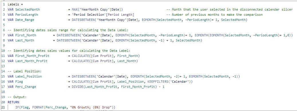
Here, for the first month and the last
month, we calculate the cumulative profits in variables First_Month_Profit and Last_Month_Profit. Then in
the variable Perc_Change we calculate the percentage of change. The variable Label_Position outputs
the dates in the second last month of the selected period, which is where we
would like to position out text label. Then
we create the variable Flag using Label_Position as filter. In the outputting IF function, we use
the flag to output at the second last month and specify different labels for
positive and negative values.
The second measure Label Colour changes colour for the label, and it uses a very similar formula:
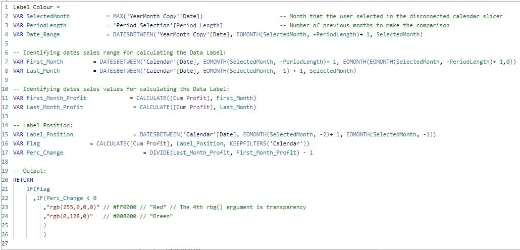
It calculates the percentage change and
outputs at the same position. The only
difference is that we specify the colours red or green in the output IF function.
Construct the
Chart
Now we are ready to build the Line chart
and create our dynamic growth label. To
build the background chart, we create a Line chart and choose our cumulative
profit measure as the y-axis. Since
we are comparing monthly figures in this example, we choose Year and Month
Name for the x-axis.
Then we create two [2] Slicers, one [1] for
the column Period from Table Period Selection, and the other for
the column Year Month from Table YearMonth Copy. We suggest turning on Single select for the Slicers (in Format -> Visual -> Slicer settings) so there
are always values selected for the measures.
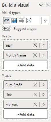
Next, besides the cumulative profit we
choose measures Line and Markers as y-axis fields for the
Line chart:
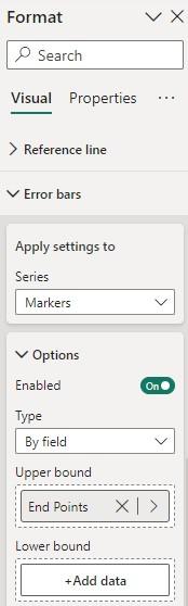
Then, we create the vertical lines by using
the measure End Points as Error bars for the measure Markers. To do that, we go to Format -> Visual
-> Error bars, choose the measure Markers in Apply settings to,
and in Options we turn on Enabled, choose By field in Type and use the measure End Points as the Upper bound.
We can further format the Error bars in Format
-> Visual -> Error bars -> Bar.
For example, it’s a good idea to choose ‘None’ for Marker shape. So far, the visual will look something like
the following if one selects ‘Jul-2014’ and three [3] months:
To build the dynamic text label we use
measures in Data labels. The options for
Data labels are located at Format -> Visual -> Data labels. We first turn off Data labels for the main
field Cum Profit, and we keep the option on for the Markers field. For the field Line, we go into Data
labels -> Values, turn on Custom label and select the measure Labels.
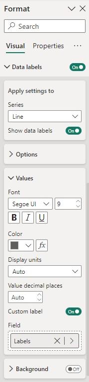
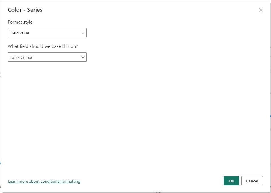
Still in Data labels -> Values,
we click the conditional formatting button (fx) of Color,
and use the measure Label Colour:
At this point, we have created all the
wonderful elements of our custom visual.
Our dynamic text label tells the percentage growth or decline, and it
even changes colour!
We can complete it with a bit of final
formatting:

Our visual is complete!
Check back next week for more Power BI tips
and tricks!
Be the first to comment