
Introduction:
Card Browser is a collection viewer with flippable double-sided thumbnails for natural navigation of your media collection. The preview side of each card presents the story’s title image and source with text samples, enabling quick discovery of interesting documents. Flip the card to reveal the Meta Data side, which lists the document properties. Click on a card to expand it into place for detailed information
Mostly, we introduce enterprise employees, store Information and newly developed products through PPT. Now, we can achieve this goal through the card browser.
Scenario:
Bob has opened a new pet shop with lots of cute animals, and now he wants to introduce them to everyone through Card Browser visual. Let us start creating this interesting report!
Steps:
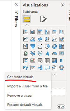
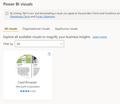
Preliminary preparation: Card Browser visual is a custom visual, so you need add it in Get more visuals. Then you can see the Card Browser display in Visualizations.
Introduction to visual properties:
Document ID: Unique ID for the document
Title: Title of the document, shown on cards and in the reader
Preview: If you put fields in it, you can only see the value of the field on the front of the card even you have put field in Content.
Content: A detailed introduction to the protagonist of the card, the content needs to be reflected in html format.
Title Image (URL): Main image(s) for the document, shown on cards and in the reader. Mainly reflect the protagonist of this card in the form of pictures.
You can refer to Image URL in Power BI to study add URL in Power BI.
Subtitle Fields: The second-level title can be used to reflect the title of the person, the breed of the animal, etc. The case here is used to reflect the breed of the pet.
Badge (Image URL): Put badges in the upper right corner of the cards, you can choose the badge image you like to highlight some of the cards.
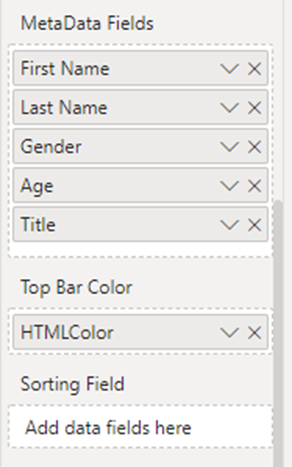
Metadata Fields: Key-value pairs for the table on the back of the cards. In this case, I used it to introduce detailed attributes of each small pet, such as age, gender, etc.
Top Bar Color: Color of the bar at the top of the cards. Content must be in hex color code format.
Sorting Field: Field that can be used to sort the visual’s data based on an arbitrary column. You can sort the cards with the column you put in Sorting Field.
Configuration:
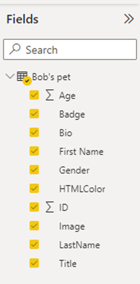
1. Create a pet table that can contain their name, gender, age, detailed introduction, pictures, etc.
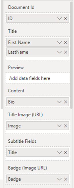
2. Put these fields in the corresponding visual attributes.
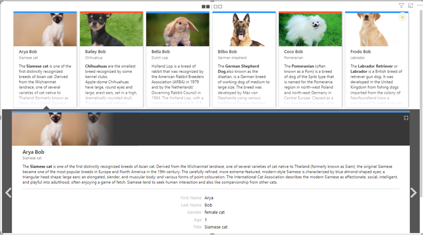
You will get a visual like the following.
You can see the different colors at the top of the cards. It depends Top Bar Color. Then you can see the pictures of each pet. It depends on Title Image (URL). Next is the breed description for each small pet, it depends on Subtitle Fields. Then next is the detailed information about each pet, it depends on Content. You will notice a logo on the last Labrador picture. You can directly mark the card you want others to notice through the URL of your favorite logo. You can do this by adding a field to Badge (Image URL).
When we select one of the cards, the bottom will also expand to display all the information on the front and back of the card.
3. The above content is about the information at the front of the card. In the beginning of the introduction, we mentioned that Card Browser is a collection viewer with flippable double-sided thumbnails. So, we are going to show how to set the content of the back of the card.
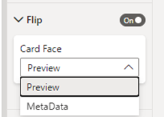
There is a setting in the visual that is related to show the front and back of the card. When you turn on Flip, you can see the front and back of the card, but when you turn it off, you can only see the content that you choose in Card Face instead of double sided.
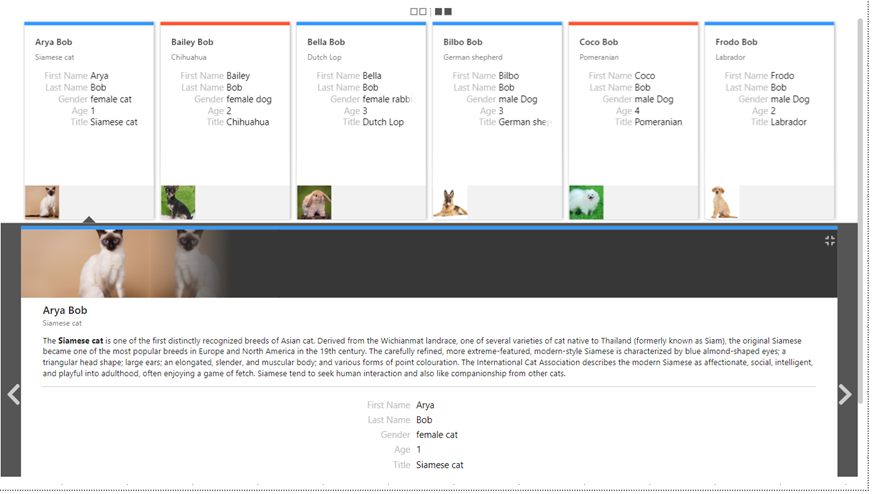
After making sure Flip is turned on, we can add some properties to Metadata Fields, we can see a different page. Now the content displayed in the card is the content we added in Metadata Fields. You can still select one of the cards, and then expand to display the entire content.
We can also choose to click the icon

4. You may notice that when I added the view properties, there were two properties that were not added. Next, I will give a detailed introduction to these two properties.
Preview:
I put column [Gender] in Preview, you can find that on the front of the card, the content disappears, only the content in the Title, Subtitle and Preview will be displayed.
If there is no content in Preview Field, the content in Content/Title/Subtitle will be displayed by default. If content is added to Preview Field, the content in Preview/Title/Subtitle will be displayed.
Sorting Field:
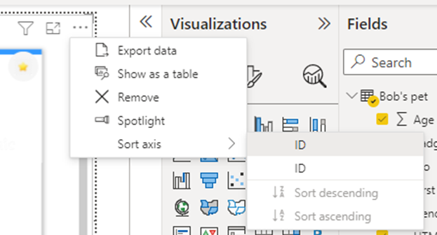
Sort your cards by integer column. In this case, I use column [ID] as the integer column. When I put column [ID] in Sorting Field, and Sort axis with ID, you can see the difference.
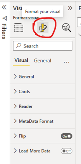
The above steps are the basic configuration of Card Browser visual. Of course, you can also set some background color and font size for this visual through Format your visual. These are similar to regular visuals, so I won’t go into details here.
I hope my blog will help you know how to use Card Browser. Come and start your custom Card Browser visual journey!
Author: Ye Tao
Reviewer: Kerry Wang & Ula Huang








Be the first to comment