We’re excited to announce the latest addition to Power BI’s new slicer experience – the button slicer! Crafted with your feedback and participation in mind, this innovative tool offers unparalleled customization and ease of use. With the upcoming November upgrade, you’ll be able to slice and dice data like never before. Say goodbye to the clunky, outdated tile slicer and hello to a sleek, flexible slicer that will help you uncover insights and make data-driven decisions faster than ever.
Feature overview
Slicers are a critical component of any report, but unfortunately, they haven’t seen many updates since their creation. Many report creators have expressed frustration with the tile slicer’s rigidity and limited customization options. To address the issue, we’re thrilled to launch the button slicer – the first kind of slicer in our new and enhanced experience. You’ll have access to a powerful tool that can compete with the tile slicer, chiclet slicer, and other custom slicers. Slicer development is entering a new era, and we can’t wait for you to experience it firsthand.

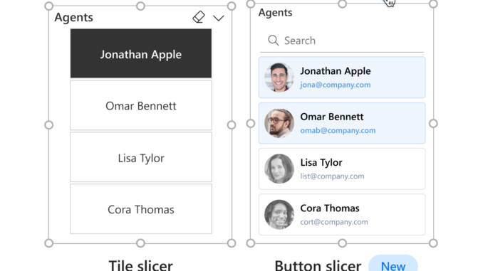
Comparison of the current tile slicer and the new button slicer.
Set up instructions
The new slicer can be found in the visual gallery in the ribbon, or the on-object dialog. You don’t have to do anything to enable the preview feature because we’ve enabled it by default.

The preview feature is found under Options > Preview features > New card visual.
Building a button slicer
There are three ways to build a button slicer: 1) Select the new slicer from the ribbon, 2) right-click on the canvas and select “Build a visual” and choose the new slicer, or 3) check or drag fields from the data pane, and select new slicer from the on-object dialog.

The button slicer requires a single field to display its content. Measures are not allowed.

Formatting the button slicer
Follow these easy steps to change the style of your button slicer: first, select the on-object edit icon. Next, select the “More options” button opening the format pane, to display all available formatting settings. Here, you can easily customize the style of your button slicer.

With the button slicer, you can customize the shape of your design by changing the corner radius. This feature is similar to the new card visuals, giving you more control over the appearance of your design.

The button slicer, with its adjustable grid layout, allows for the division of your design into rows and columns and uses pixels to customize card spacing. 
For grid layouts with more buttons than rows or columns, you can manage their appearance using overflow styles. Choosing from either Continuous scroll or Pagination, both styles offer vertical or horizontal direction, providing more flexibility in your design.

Unleash the power of the button slicer, a game-changer that revolutionizes alignment and format properties just like the new card visual, while its Label feature spotlights crucial details from your data fields or measures right within your buttons.

The Image control is a magic tool in a vibrant world where you can infuse your buttons with images from a data field brimming with URL images. The button slicer is your wand opening a multitude of options to craft breathtaking designs, like painting with light and pixels. 
Revolutionize your designs with interactive states and tailor your design’s response to user actions, making your work more engaging. With the freedom to customize each state – default, on hover, on press, and selected – it’s a new design playground of flexibility and interactivity.

Unleash a wave of creativity with the button slicer’s new formatting settings, and step into a world of versatility that transcends previous core visuals. More than just a tool, it’s a thrilling new era of data visualization, sparking excitement at every turn.

Interactivity

Multi-select
Great news! The button slicer now provides a multi-select feature when the ‘Single Select’ toggle is off, eliminating the need to press CTRL for multi-selection – a significant step towards enhancing user convenience and efficiency.

Clear selections
The ‘Eraser Icon’ has been upgraded to a fully customizable icon header, under Properties > Header Icons in the format pane, simplifying your user experience with this new feature.

Tooltips
The new slicer now supports both default and report page tooltips, enhancing your data visualization experience. For a comprehensive guide on setting up a tooltip experience, we recommend our detailed documentation on creating default and report page tooltips.

New slicer roadmap
Our new slicer roadmap is set to unfold in a series of captivating stages.
- Stage 1 Button slicer (current release)
- Stage 2 List and dropdown slicer
- Stage 3 Slider
- Stage 4 Calendar slicer
- Stage 5 Relative slicer
We’re buzzing with excitement to hear about your experiences with our new slicer! Stay tuned for thrilling updates as your feedback propels us towards continuous improvement.

Be the first to comment