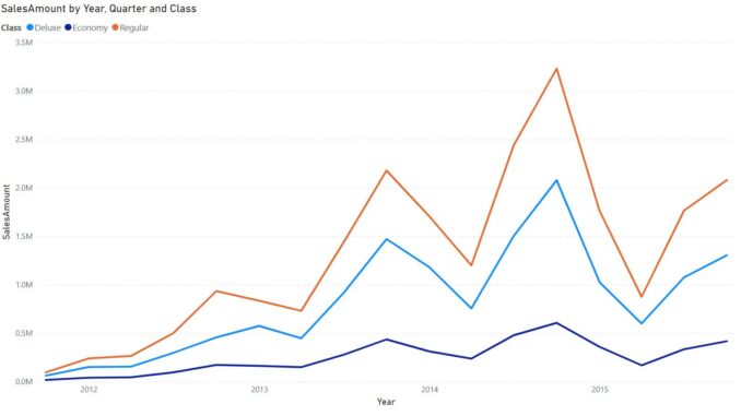
You may now add error bars to your line charts to visualise the uncertainty in your data. For forecasting in particular, uncertainty is an important aspect to data, especially in scientific disciplines and other fields where the displayed value of a point needs to be contextualised by the range of its possible values. With this new feature, you can specify upper and lower bounds to the values on your line chart and customise the way the uncertainty is presented within your chart.
To begin, make sure that the error bars Preview feature is enabled by going to File -> Options -> Preview features and making sure the error bars checkbox is checked. Also, please make sure you enabled ‘New Format pane’ feature as this ‘Error bars’ functionality is available for the new Format pane only. Then, create a Line chart and add a measure for which you have upper and lower bound fields to display.
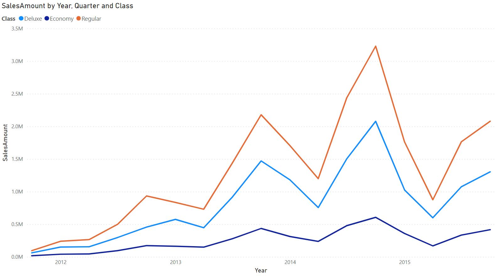
In the Analytics pane, you will see a new ‘Error bars’ card. At the top, notice a dropdown to select the measure to which you would like to add error bars. Beneath it, you’ll find options to enable error bars for this measure, add upper and lower bound fields, and indicate how the upper and lower bounds relate to the measure. ‘Absolute’ means that the fields contain the exact value of the upper or lower bound, whilst ‘Relative’ means that the fields contain the difference between the upper or lower bound and the measure.
For example, if at one point your measure has a value of 60, an upper bound of 90, and a lower bound of 45, your upper bound field in absolute terms would be 90 and your lower bound 45, whilst the upper bound in relative terms would be 30 with the lower bound -15. Choose the option which suits the format of your upper and lower bound fields accordingly.

By default, these intervals will be represented by a vertical line with horizontal caps on either end.
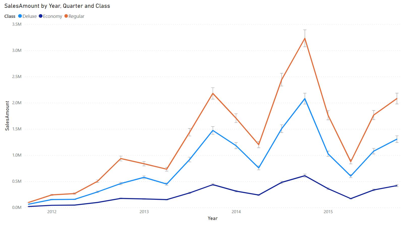
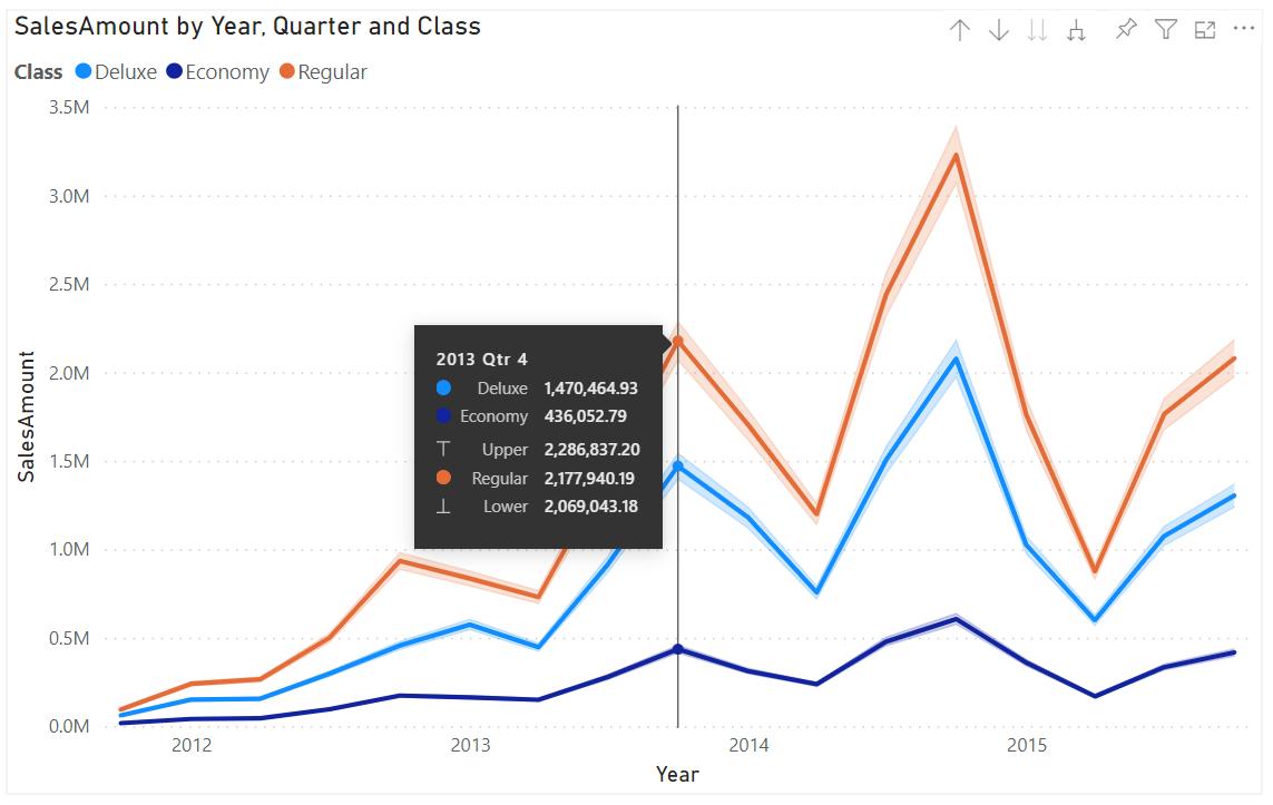
You can also represent your uncertainty in other ways, like with lines, shade areas, and markers. Turn them on or off and format them to your liking in their associated sub-cards.
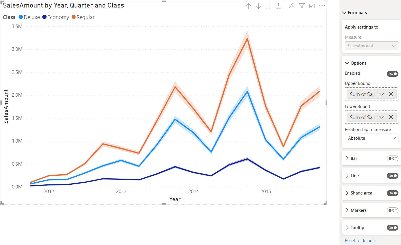
Hovering over a point will show the values of the nearby error bars in a ToolTip:
Check back next week for more Power BI tips and tricks!

Be the first to comment