

Welcome back to this week’s edition of the Power BI blog series. This week, we will show you how to label periods on a visual.
Different things may affect sales and revenue. Holidays generally lead to higher
consumption, businesses themselves can host sales campaigns to boost the
figures, and unfortunate events can also happen to hurt businesses, such as
COVID-19. So, when creating sales
visuals in Power BI, how do we highlight such events?
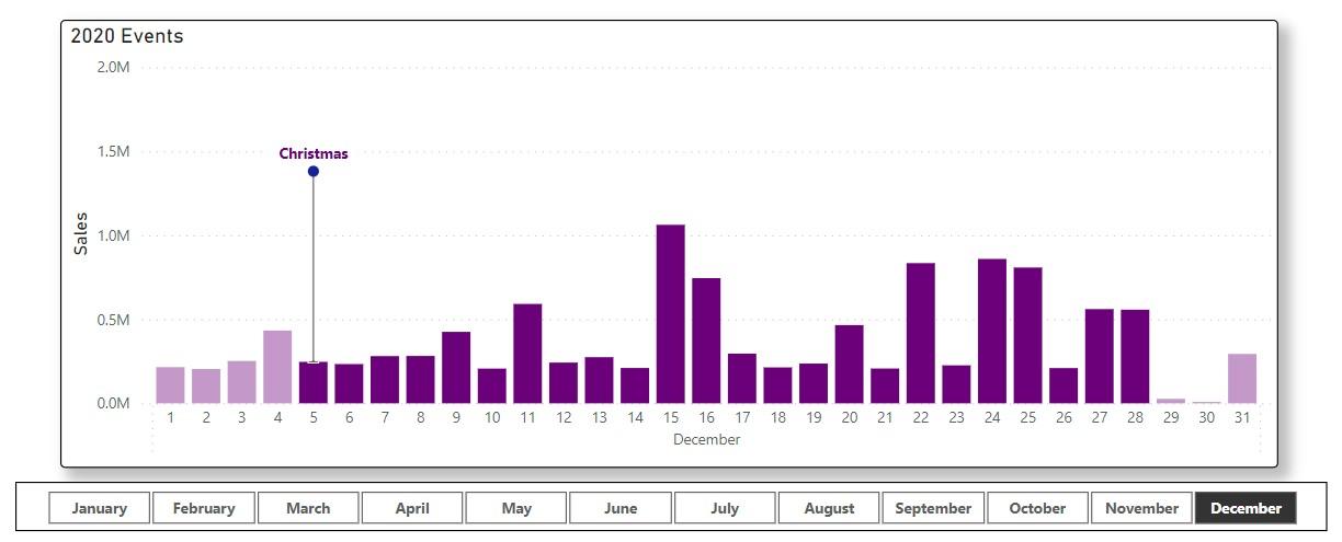
We simulated a sales dataset for 2020 and selected a few
events for the year. With that, we built
the above visual which highlights the duration of an event and displays the
event’s name in a label.
We will go through detailed steps to build this visual, and
you can download our data workbook and sample file to follow along.
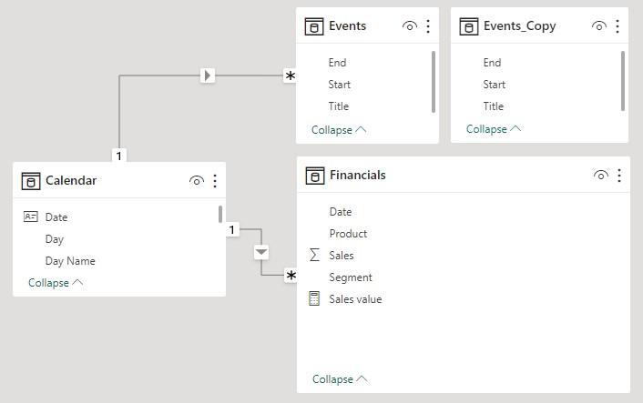
Chart
Data
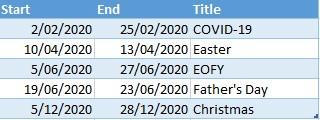
Besides the
main dataset, we need details of the events to build the visual. In our workbook we included the Table Events:
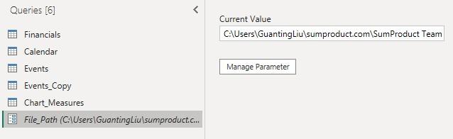
You need to
load both the main Table Financials and the Table Events into
Power BI. We created a parameter File_Path in Power Query. After downloading our
data workbook, please change the parameter to your local file path of the
workbook.
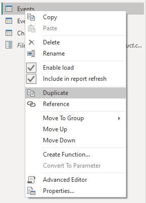
We also
need two [2] copies of the Table Events, one unconnected and one
connected to Calendar. To make a
duplicate of the Table Events, we right click on it and choose Duplicate.
Finally, we
build a Many to one relationship between ‘Financials'[Date] and ‘Calendar'[Date],
and another Many to one relationship between ‘Events'[Start] and ‘Calendar'[Date].
The
‘Event flag’ Measure
Now let’s
create the first chart measure that can be used to change colours to highlight
a period. The measure is a flag checking
whether the current date is related to any events, and we will use the
unconnected copy of the Table Events.
Event flag =
SUMX(Events_Copy,
INT(MAX(‘Calendar'[Date]) IN CALENDAR(Events_Copy[Start], Events_Copy[End])))
The function SUMX executes on each row of the Table Events_Copy,
where the CALENDAR function creates a single-column Table containing the
dates between Start and End of an event.
The MAX function returns the current date of Calendar. The logical operator IN checks whether
the current date is within duration of the event and returns TRUE or FALSE.
Lastly, the INT function converts the Boolean values
(TRUE or FALSE) to one [1] or zero [0]. Then, SUMX sums up all rows of events in Events_Copy. That means the measure equals to zero [0] if
the current date is not contained in any events, and it equals to one [1] if
the current date is contained in one [1] and only one [1] event. The measure can be greater than one [1] if
multiple events are overlapping, but we will only be using it as a
zero/non-zero flag.
To build the combo visual, we first create a Line and
Stacked Column chart, use Month Name and Day as x-axis
fields, and use Sales as the column y-axis field. Here, we have created a simple measure for
the sales values:
Sales value =
SUM(Financials[Sales])
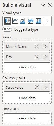
Then, we insert a Slicer on Month Name.
Now, we can use the measure Event flag that we just
defined to highlight the event periods. Inside
the Format pane for the chart, we go to Visual -> Columns -> Colors and click the Conditional formatting button (fx).
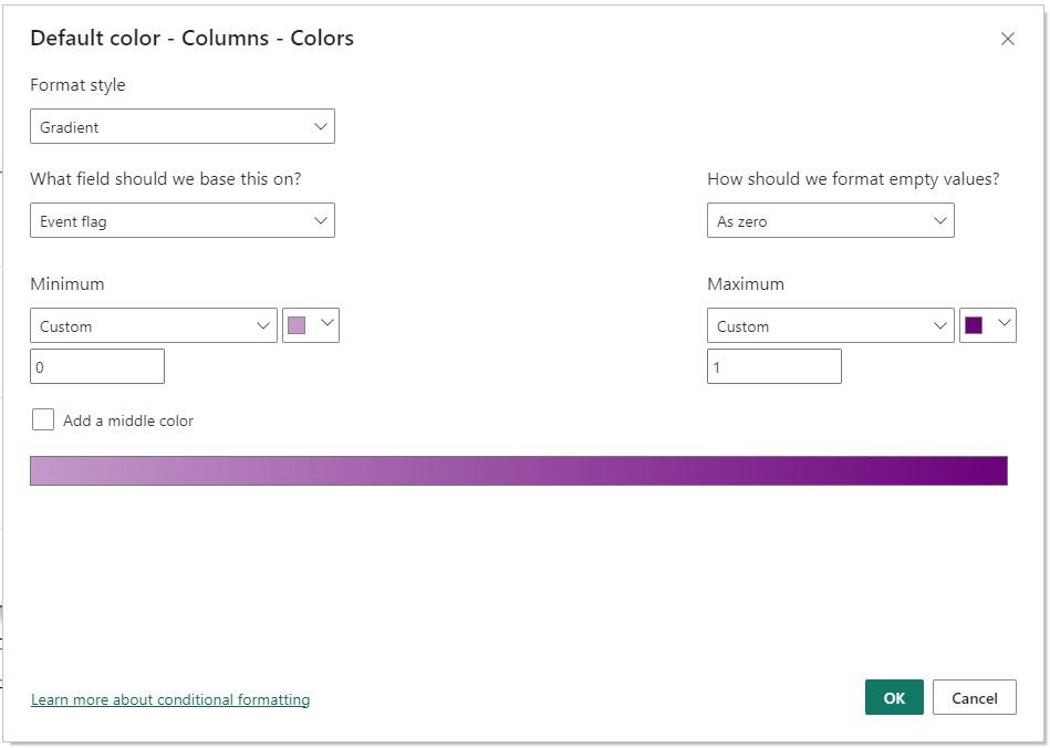
Here, we choose the Gradient style and select the
measure Event flag. For Minimum
and Maximum, we choose the colours that we want for ordinary periods and
periods with events. Also, we set the Custom values to zero [0] and one [1]. That
way, non-zero values equal or larger than one [1] will all be treated as one
[1].
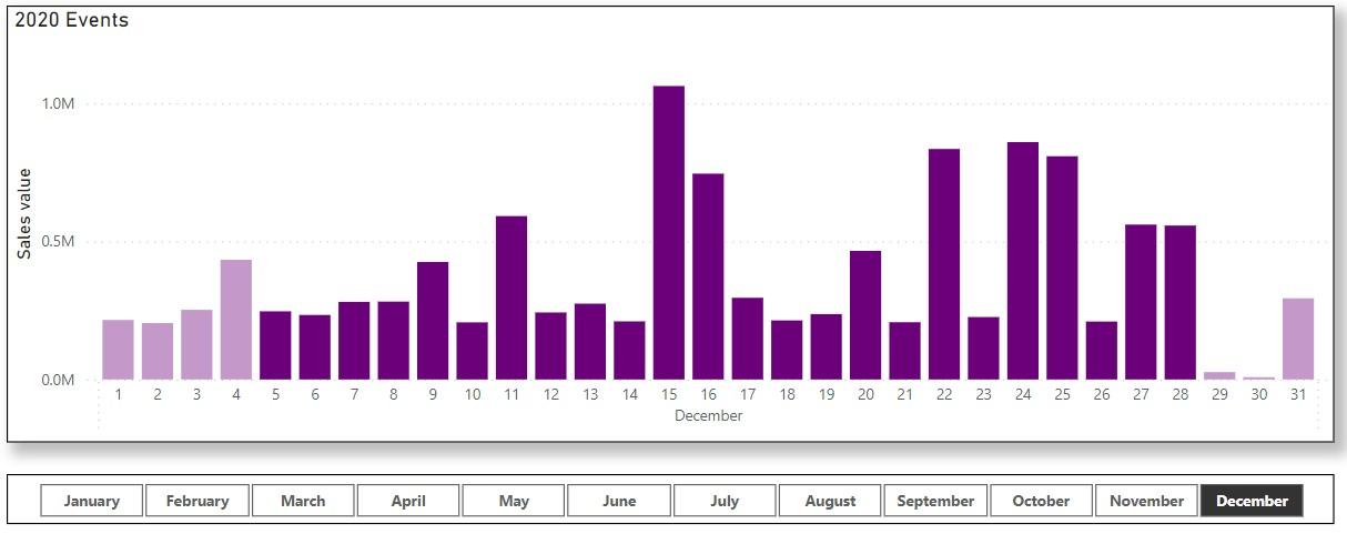
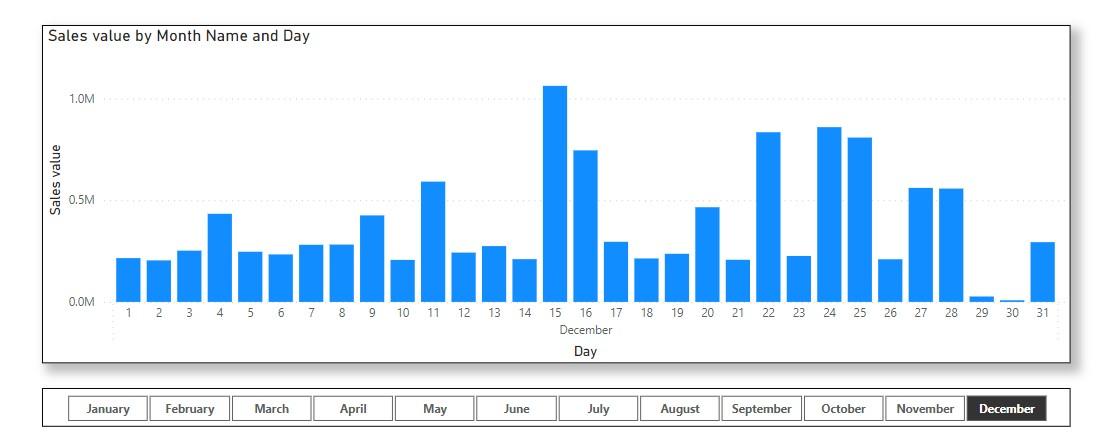
Now the Christmas sales campaign from 5th to 28th December
has been highlighted, so are other events in the year.
That’s it for this week’s Power BI blog. We will go through the other chart measures
and how to complete the visual next week.
Hope you’ve enjoyed our article, and please stay tuned for more thoughts
and insights from http://www.sumproduct.com.
Be the first to comment