You might encounter issues with measures in Power BI table visualizations with a total row. The usual complaint is that the “Total” row is “incorrect” for the measure. Usually, the total row is correct for the measure, it’s just not what most people expect. In this tutorial, I’m going to take us through this common problem with Power BI measure total and how to solve it. You can watch the full video of this tutorial at the bottom of this blog.
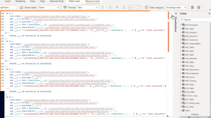
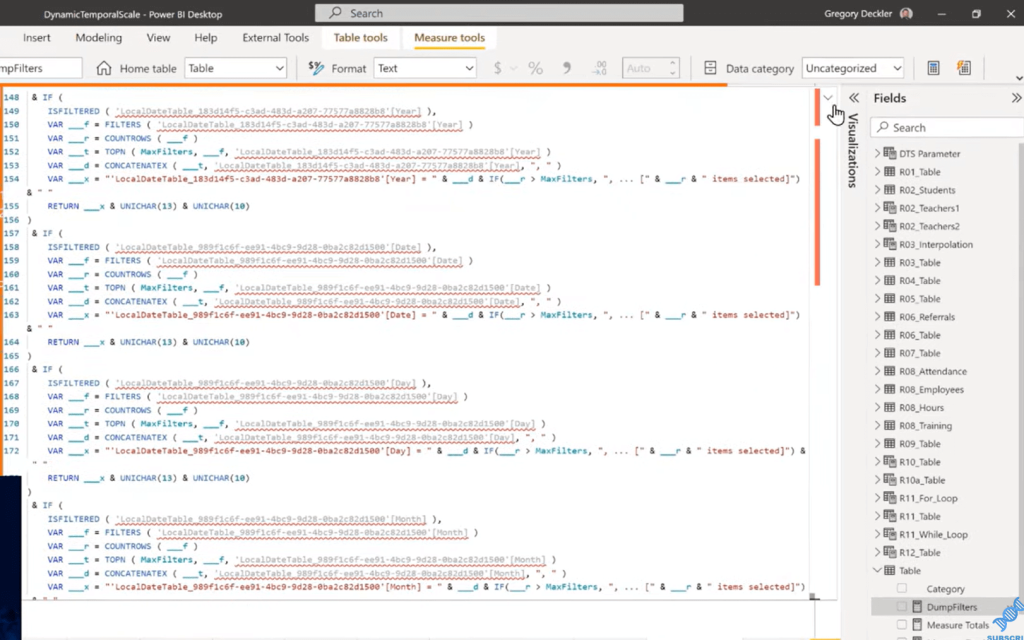
Power BI measure total has been a problem for as long as Power BI has been around. So to fix this problem, the first thing I did was I went into DAX Studio and created a dump filters measure. If you’ve never seen a dump filters measure, it looks a lot like the one below.
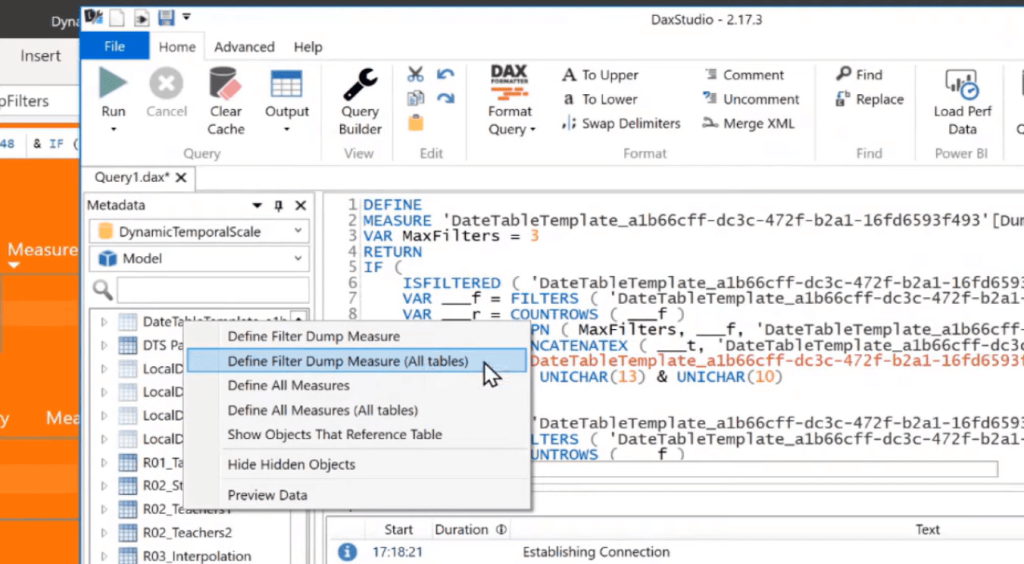
Dump filters measure determines what filters are applied from the different tables and columns within the data model. It’s really easy to generate within DAX Studio. You can launch DAX Studio, click any table and say, Define Filter Dump Measures (All Tables), and it generates all the code for you.
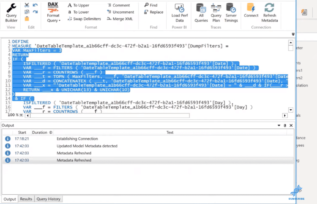
All you have to do to get it into Power BI is take it from this VAR MAX filters and copy all of that code and then just paste it into a new measure, which is what I did. That’s where this dump filters measure came from.
I also built a tooltip page where I created a card visualization and put the dump filters measure in that card visualization. This allows us to view the filters within the table visualizations or the matrix visualizations.
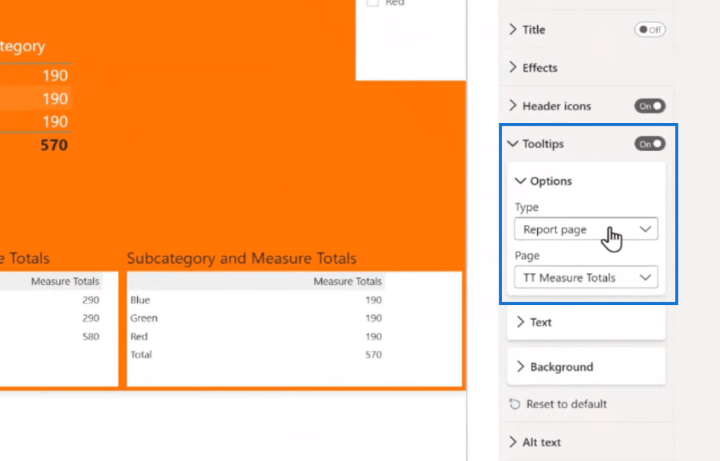
To turn tooltips on, you can click on a visual on your matrix or your table. In this example, I have a matrix and a table here that both demonstrate the same measure totals problem. You can go to General and just toggle on tooltips. If you want to, you can specify that it’s a report page.
If I hover over this 290, I can see that it has a filter on it of table category equals category one. This one is category two, where we have a Subcategory equal to blue, green, and red. This all comes from a very simple data query where I have six rows.
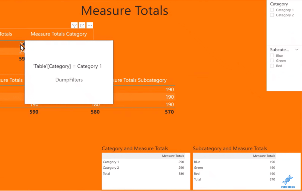
The last step is to create a measure that’s going to exhibit the measure total’s problem. And if you’re looking closely, you can already see that the total is not correct.
As far as DAX is concerned, it’s correct, but any normal human looking at this would think this is completely wrong. In fact, I have to believe that this is probably a leading cause of why people think it’s a huge barrier to the adoption of Power BI.
There’s the simple fact that measure totals are wrong out of the gate. The table visualizations and matrix visualizations don’t actually exhibit correct behavior.
Using A Surrogate Measure
I have this table here with my measure totals. All I’ve done is a quick SUMX and subtracted 10. This is a surrogate for any reasonably complicated measure. If you can exhibit the measure totals problem with something as simple as this, it’s going to crop up in a lot of your measures.

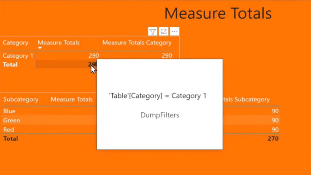
The filter context for this totals row is different, so it appears that DAX is just executing in the context of all. If I click on Category 1, for example, it’s correct.
So, it’s obviously taking the filter context of the Category = Category 1.
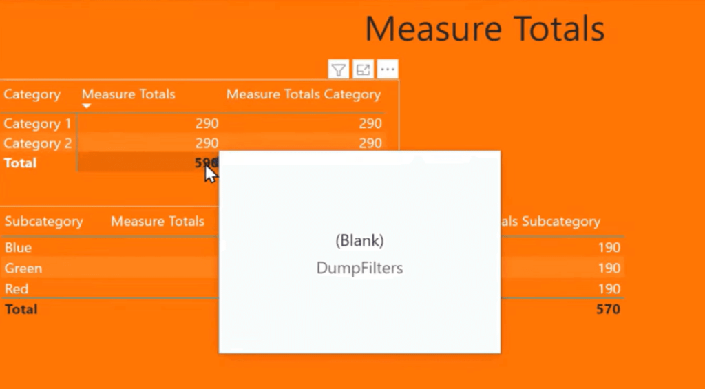
It doesn’t have this additional filter context of this category without external influence. If I hover over here, you can see that it’s blank. There’s nothing filtering this right now. These rows have a filter on the category, but it is not taking that into account at all.
So how do we fix it? Let’s take a look at the measure I created.
Fixing Incorrect Power BI Measure Total
I called this one Measure Totals Category, and it says, if ISINSCOPE table category, then just return my measure that is correct on a line-by-line item.
Otherwise, I’m going to SUMMARIZE that table by category, and then I’m going to calculate my measure for each line. Then I’m going to sum up the values.
Basically, I’m recreating this table visualization, then I’m summing up the resulting values from that measure on those rows, and that fixes it.

Now, this is all well and good. It’s a fairly easy fix, but it’s really damaging to self-service visualization, in my opinion.
If you have a reasonably complex measure and you’re promoting self-service visualization back to your end users, then it’s a good bet that you have no idea how they’re going to use that measure, and how they’re going to be working with it.
For example, you can see the problem here. I have the Measure Totals categories correct, but it’s incorrect down here. It even returns the wrong line-by-line items.
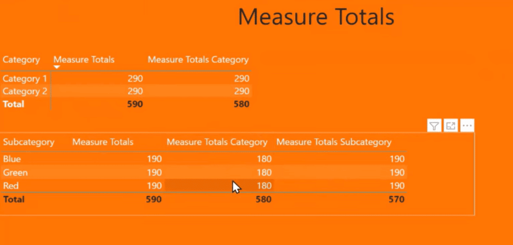
The reason for this is that categories are never in scope. So according to our measure, the ISINSCOPE table category returns the measure totals.
Well, that’s never the case. It’s always doing a summarization by category and then by value, which is completely wrong.
So now, we have to create another measure, Measure Total Subcategory, which if ISINSCOPE subcategory, returns the line item on that row. Otherwise, you sum up by subcategory in total the values, which gives us the correct answer.

***** Related Links *****
Fixing Incorrect Totals Using DAX Measures In Power BI
Power BI Percent Of Total – Using CALCULATE Statement
Finding The Percent Of Total In Power BI
Conclusion
This is why it’s damaging to self-service visualization because you have no idea how the end users are going to be using it, and what they will put into a table. You’ll need to write a measure for every possible combination, which is crazy.
I hope you’ve learned something from this tutorial. If you have encountered problems like this, share with us how you’ve dealt with them.
All the best!
Greg
[youtube https://www.youtube.com/watch?v=dgwsk2fjWLc&w=784&h=441]

Be the first to comment