Blank explanation message
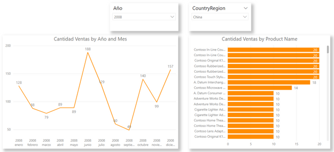
The idea for this article is to show a message to the user when a selection of filters results in blank data producing empty visualizations. There might be other solutions besides this one, but I like this more and that’s why I’m showing it.
To build this, we need to write some DAX and manipulate the UI due to our solution is about making the visualization transparent and place a card with the message behind. The card will be the background UI for the visualization, and it will keep clean while everything is ok, but the text will show up when something is not ok.
Let’s see first our DAX code for the Card:
IsBlank Cantidad Ventas =
IF(
   ISBLANK([Cantidad Ventas])
   , “There is no data for the filter selection”
   , “”
)
The solution is quite simple. We are asking if the measure or measures on the visual are returning blank. If they do, we add a message explaining that the reason of the blanks to let the user understand is not an issue of the tool. If the measure is not blank, then we are keeping the card empty returning two double quotes. We are using double quotes and not blank because that keeps the card clean. The blank shows “(Blank)” text. Let’s check a simple scenario
Let’s overlap a card over the line chart and reorganize to keep it behind. In the card we are disabling the card label to keep it completely clean. Like this:
Card, white background, not labels. Once we have it behind the line chart, we should remove the background for the line chart. If we make it correctly there should not be any UI difference for the graph. Let’s check a gif in action.
Instruction message
The blanks are not the only approach. We can think different usages for the technique like instructions for the user. For example, if we have a visual that shouldn’t display anything until you make some actions. Taking the same page of the report we can say that the product ranking (the visual on the right bottom of the page) should only show data if we select only one CountryRegion. You can think it as each country sells so different products that you would never check all countries ranking. We could show a message like “Please select one Country Region to see the ranking”.
To build this we need DAX help again. The difference with the previous solution is that we will use the measure for both visuals. The card as the main value and as visual level filter in the graph to avoid all countries data. Let’s see the code:
One Country in Store msg =
IF (
   HASONEVALUE(Stores[CountryRegion])
   , “”
   , “Please pick only one country to see the ranking”
)
As you can see, instead of looking for a blank, we are checking if there is a single value for CountryRegion on the filter context. If we have more than one, we are showing the message.
We need to make one more tweak this time. If we add the card behind the visual. Change background and all, we should get this:
The new step here is hiding the visual data when there is more than one CountryRegion to avoid that ugly overlapping view. To make the effect open we are opening the filter pane and add the measure as visual level filter with the condition “is empty”. Apply filter.
Our “” double quotes in the code are translated as “empty” for the engine. That is quite helpful to let us keep one single measure without the need to create another one for the values of the bars. The result looks like this:
That’s how we take the knowledge of the blank message to build a new strategy for the user experience. I’m sure that there are a lot more ideas like this one to help our users keep a clean easy development.
I hope the post helps you. Let’s improve UX 😊


Be the first to comment