In this tutorial, you’ll learn how to create a Line Chart for your SSRS paginated reports.

When creating a line chart, you need to consider that your table is dynamic. The information changes depending on the parameters you set.
For each region, the table could either fill up the entire report page or only consume a small portion of it.
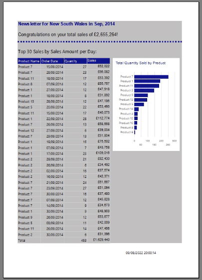
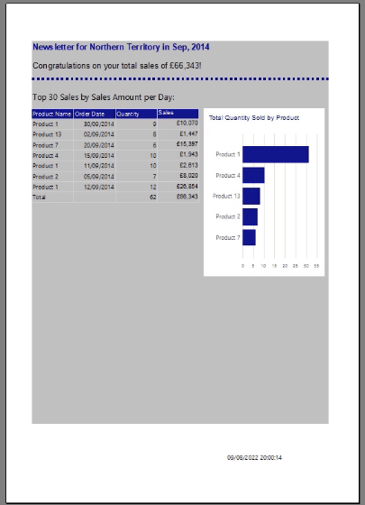
This dynamic fluctuating table will impact the line chart you create.
For this basic example, the table and charts will only show the Top 10 Sales so that the discussion will focus on the creating the Line Chart rather than formatting the report page.
Line Charts In SSRS Paginated Reports
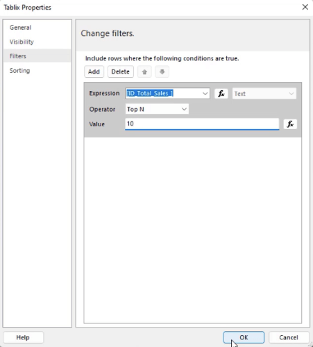
To make the matrix show only the Top 10 Sales, open the matrix Tablix Properties. In the Filters tab, set the Operator to Top N and the Value to 10.
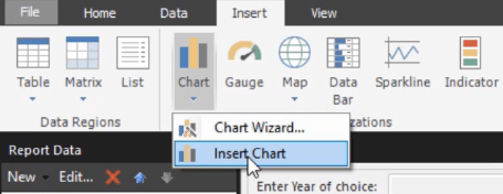
To create a new chart in Report Builder, go to the Insert tab and select Chart > Insert Chart.
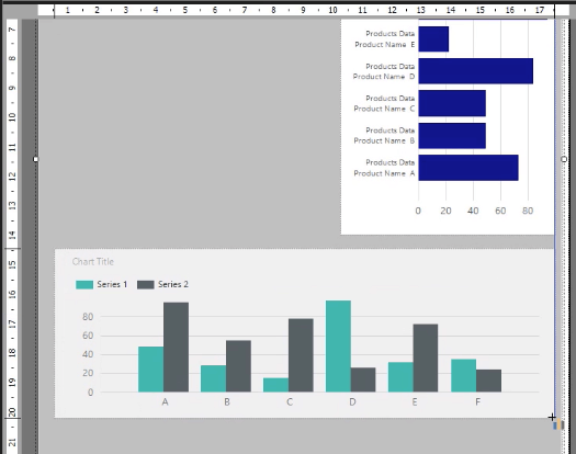
Drag the mouse pointer to the area where you want to place the chart.
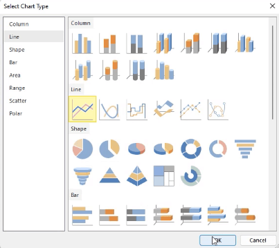
Once done, the Select Chart Type wizard will appear. This example will be using a simple Line chart.
You can adjust the Line chart’s position and size either manually or by using the Properties pane found on the right-hand side.
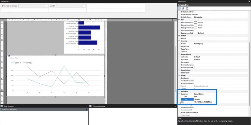
When you click Run, you’ll see how the Line chart appears in the Report.
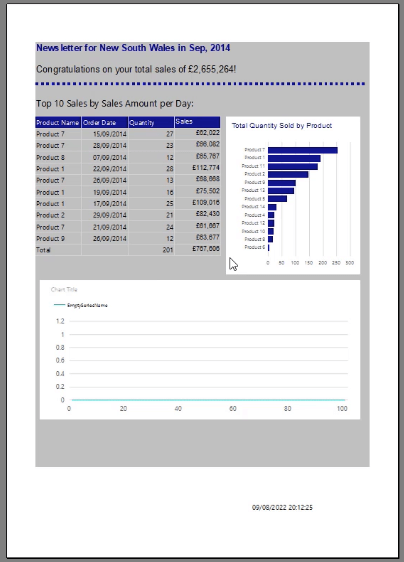
Chart Title, Series Values, & Chart Axis
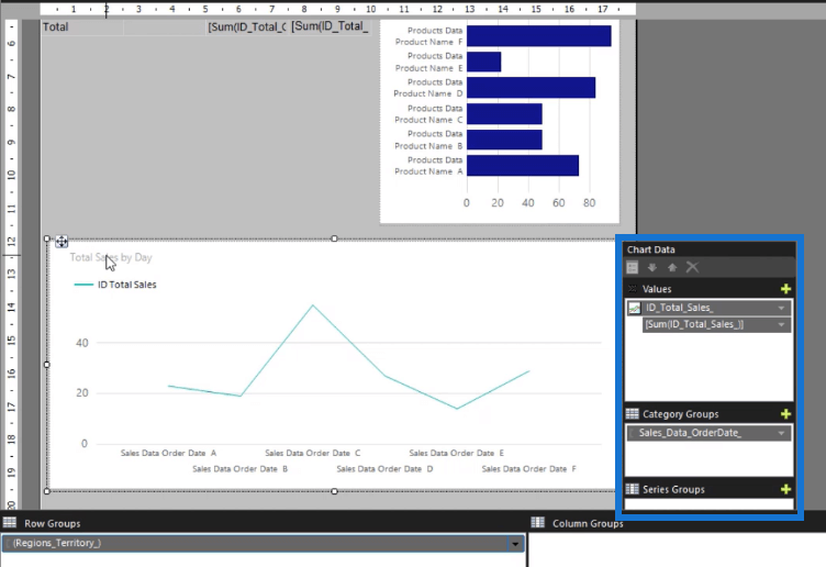
To add a chart title, double-click on the Chart Title textbox and type in the name you want to use. For this example, the chart title is “Total Sales by Day”.
In the Chart Data wizard, assign Total Sales to the Values and change the Aggregation to Sum. For the Category Groups, choose the Sales Data Order Date.
You can then format the color and size of the title and data line using the Properties pane.
To format the line chart’s horizontal axis, right-click on it and select Horizontal Axis Properties.
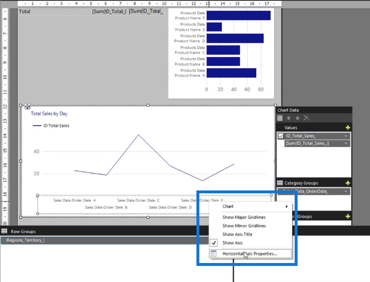
Go to the Number tab and select Date. Then, choose the date format you want to use.
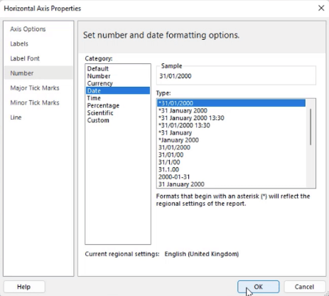
Do the same for the vertical axis. Right-click on the vertical axis and select Vertical Axis Properties. Go to the Number tab and select Currency.
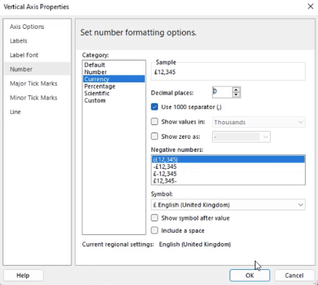
After formatting the axes, you can make other changes to the font, background, and border color. The key is consistency. It’s important to make all the elements in your report look cohesive.
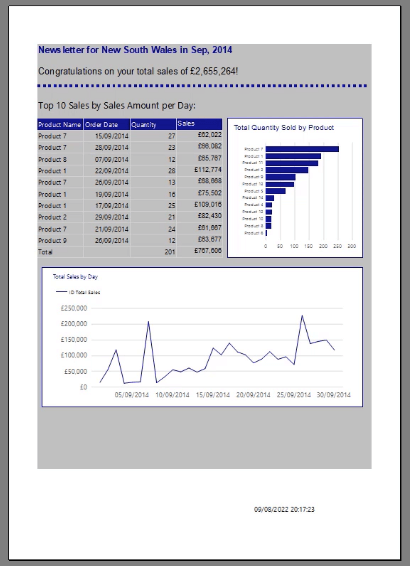
When you run your report, you’ll see that the line chart is now easier to read after the formatting changes.
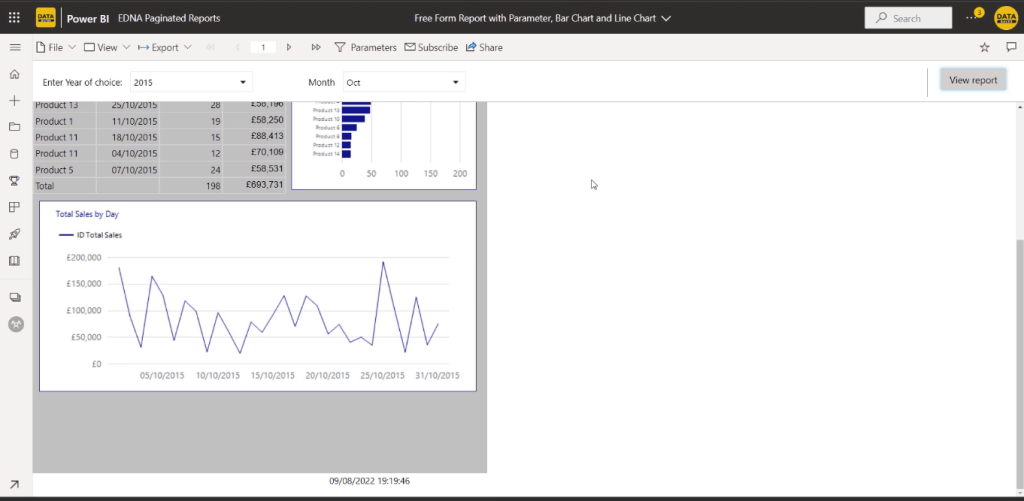
Once you’re satisfied with how your report looks, you can publish it to the Power BI Service.
***** Related Links *****
Different Bar Charts In Power BI To Elevate Your Reports
Lollipop Charts In Power BI Custom Visual
Comparison Bar Charts With Charticulator In Power BI
Conclusion
A line chart is one of the ways you can add visual insights to your paginated reports. It helps users to better understand the information you’re presenting.
Report Builder can be slightly confusing when you first start using it. But once you get accustomed to what it is and what it can do, you can be creative and use it to create various visualizations.
All the best,
Sue Bayes


Be the first to comment