
Scenario:
For Power BI users, a problem often encountered is that they want to put the measure on the axis, but find that it cannot be achieved. Especially beginners want to do this habitually. Below I will give an example to explain this problem.
Basic situation: After a period of merchandise sales, a group of sales representatives will face performance evaluation.
Table used:
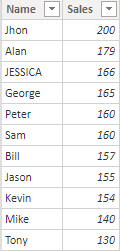
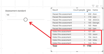
There are 11 people in the table, and sales range from 130 to 200. According to dynamic assessment standards, real-time statistics are made on the number of people who have passed and failed the assessment standards.
Common incorrect solutions for the beginners (By creating a calculated column/measure):
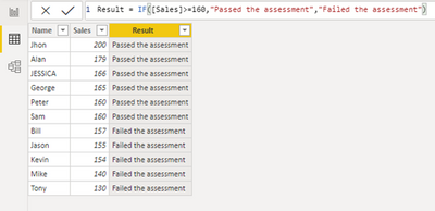
Create a calculated column named [Result].
The passing standard is 160, 6 people passed the assessment standard, and 5 failed.
Create a measure [Count people] to count the number of people in different states.
Count people = COUNTROWS(‘Table’)
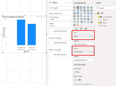
Create a stacked column chart. Take [Result] as the axis and [Count people] as the value. You can see the statistics of the number of people classified as ‘Passed the assessment’ and ‘Failed the assessment’.
Create a what-if parameter to a dynamic assessment standards.
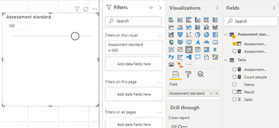
After the above operations, the [Assessment standard] parameter table and slider control will be automatically generated.
Modify the [Result] calculated column as
Then, in theory you can use a slicer containing [Assessment standard] to dynamically filter the results. However, after practice, since the calculated column will not be affected by slicers or filters, and the default value of [Assessment standard Value] is 160, [Result] will not dynamically get a new value.
The principle of the calculated column is: it is calculated once when the data is loaded, and it mainlyccupies memory resources; the measure is calculated in real time as the calculation context changes, and it mainly occupies CPU resources.
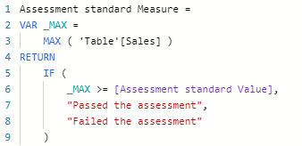
- If the calculated column fails, then let’s try to create a measure. Create a measure as
- Create a stacked column chart. Then you will find that the [Assessment standard Measure] can’t be put into the axis.
Correct solution:
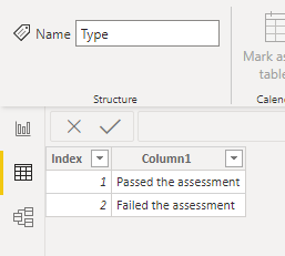
- Create a new table named [Type].
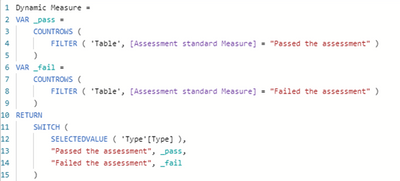
- Create a measure.
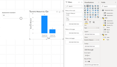
- Put the [Dynamic Measure] measure and the [Type] column into the stacked column chart. The values will dynamically change the results according to the filter of the slicer.
Since the chart must present the meaning of the logical relationship between the data, the data must be grouped according to certain standards (dimensions), and then various aggregation operations are performed. This is the fundamental reason why the measurement value cannot be used as the axis of the chart.
Summary:
- When there is a lot of detailed data, in order to ensure the efficiency of report opening, try to use measures instead of calculated columns; if you need to adjust parameters in real time and obtain analysis results in real time, you can only use measures.
- For more details about DAX, you can refer to: DAX in tabular models.
- (1) Create a transition table corresponding to each possible classification type;
(2) Use the classification standard field of the transition table as the axis field in the chart (grouping condition);
(3) Construct a separate type for each category ([Compliant] and [Not Compliant]);
(4) Construct the [quantity selection] measure, and call the corresponding individual count metric value as the value field of the chart by judging the classification criteria of the filtering context.
Please check the attached file for details.
Author: Stephen Tao
Reviewer: Kerry & Ula



Be the first to comment