

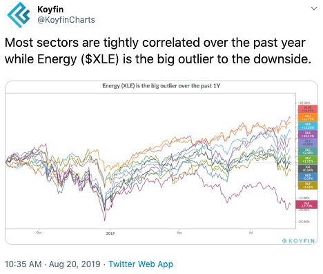
Today’s Chart of the Day was shared on Twitter by Koyfin. It is a performance chart of the 11 sectors of the S&P 500 over the past 12 months. Koyfin notes that the Energy Sector “is the big outlier to the downside.” The Energy sector ETF, $XLE is down 17.74% while the S&P 500 is up 1.79%. This is likely due to the weakness in Crude Oil which has fallen nearly 15% over the same period. Even the Financial Sector, (second worst-performer) has fared significantly better than Energy. It’ll be interesting to keep an eye on this relationship going forward to see if Energy will catch-up to the rest of the pack.
Be the first to comment