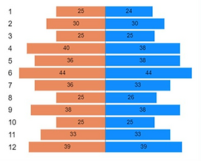
In an effort to break the routine and be original, data visualization practitioners often attempt to create special graphs For example, “Tornado graph”.
Initially, it seems to be an interesting way to compare two metrics that are drawn against each other.
Budget VS execution, for example. In the picture above, you can see the execution of the budget on the right (blue), and the budget amount on the left (orange).
This interesting and special graph can be perfectly integrated into any business dashboard.
But does it let you know where the company stands in relation to its budget?
No, it is not. An optimistic view would be challenging, if not misleading.
Here are some reasons why:
1. We cannot calculate a ratio between two sides because our brain compares length to height, not width.

2. There are two sides to the shape, and what is on the left can be perceived as negative. The axes have no meaning in the context of a budget, of course.

3. A list of months is a timeline.
A horizontal timeline is more familiar to us than a vertical one.
What is the right way to do it?
The first step is to understand the user’s needs and the decisions he will take based on the data.
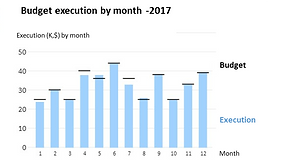
There are few options when it comes to budget vs execution. Here are two examples:
1. If we want to visualize the percent deviation from a budget, we can create a classic column graph with the budget on axes 0 and the deviation rate on the columns.

2. If you need to see an absolute deviation ($), you can use a “bullet chart” in its simplest form. Budget – “the boundary line”, execution – column. Graphs like this can be used as a “reinforcing player” in situations where you want to see deviations as well as absolute numbers.
*All Graphs created with POWER BI


Be the first to comment