Preamble
What if when Power BI was released all those years ago that it defaulted to table and matrix totals simply summing the rows? Let’s explore this alternate reality and how you would handle displaying an alternate summary of information in a table or matrix.
Introduction
As we all know, the total row for table and matrix visuals in Power BI displays a sum of the rows. Obviously, for 95%+ of the world’s population this is entirely expected behavior. After all, the definition of the word total is “a product of addition: sum” and this is what we have come to expect since this is how totals work in every spreadsheet, reporting and business intelligence tool ever created. Even before software, accountants and other business users who displayed totals for tables on paper, the total row always summed the rows of the table. In fact, a total summing the rows of a table is so ingrained into the human psyche that it honestly feels a little weird explaining and justifying this behavior.
But, Power BI provides the powerful formula language, DAX and DAX is so powerful that it provides alternate ways of thinking about what we might display in a summary line for a table or matrix. This article explores an example of one of those edge cases where we might not want to display the sum of the rows in a table but rather do something a little different.
Scenario
Suppose we have the following set of example data:
This table simply lists a unique customer identifier, Customer, along with the products they have purchased, Product. If we create a simple measure for counting the distinct customers like so:
Distinct Count = DISTINCTCOUNT('Table'[Customer])And we place this meaure into a table visual along with the Product column, we get the following:
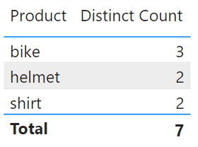
Here we can clearly see that the Total line displays the number 7, which is the sum of the individual rows in the table, 3 + 2 + 2 = 7. And it is important to note here that all Power BI visuals calculate totals this way such as the stacked column chart, stacked bar chart, and stacked area chart. Clearly, it would be ridiculous and confusing for end users if Power BI calculated totals differently depending upon which visual was used.
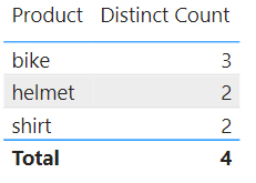
However, in this case, the report author wants to display a summary of the distinct count of all customers within the data. Since different customers bought the same products, they are distinct within the context of each product but there is some double counting going on within the Total row from the perspective of the overall count of distinct customers. From this perspective, the summary row of the table should display a distinct count of 4.
Never fear! There is an easy and straight-forward way of displaying the desired value without any additional DAX code!! This approach is super simple and only involves a bit of configuration and the creation of 1 or 2 additional visuals. Let’s get started!
- Create a Card visual and place your Distinct Count measure into this Card visual in the Fields field well
- Format the Callout value to be the same font and size as the table, for example, Segoe UI Bold, 10
- Resize and position this Card value over top of the number returned by the table visual in the Total row
That’s it! With three simple steps, we now have this:
Now, obviously the word “Total” being in the summary row is a potential problem since it is going to be super confusing for end users to have a Total that is not the sum of the rows. Therefore, to avoid such obvious confusion, an improvement to this techique is to do the following:
- Turn off the Total row for the table
- Create a new measure that is simply: Summary = “All”
- Place this new measure into the Fields well of a new Card visual
- Resize and reposition this Card visual in relation to the table
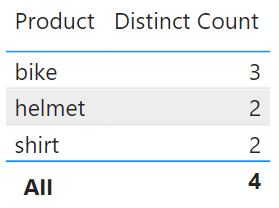
With this four additional steps we get the following:
Performing these additional steps will prevent user confusion and improve the natural readability and understanding of the report.
Now, is this technique fool proof? No. In self-service visualization and other scenarios, the rows in the table and matrix may change and this can mess up the positioning of the visuals relative to one another. In these scenarios, I often find it preferrable to turn off the Total row for the table or matrix and use a single card visual above the table or elsewhere on the page like below:
This technique is perhaps even better considering that even with proper labeling, end users are still going to be initially confused when they see a number in the summary row of a table that is not the sum of the rows.
Conclusion
DAX is a powerful formula language that can shift one’s perspective about what report authors might want to provide as summary information for a table or matrix. However, care must be taken when providing a summary that is not the sum of the rows as this can create massive confusion for end users. And certainly, NEVER, leave the “Total” label present in the visual if you are providing an alternate summary that is not an actual total.
If you would like Microsoft to provide a toggle that allows the default behavior of summing the rows or an “all”, then vote for this idea. I am 100% certain that, without fail, Microsoft will provide such an alternative in the next 7 years or so…


Be the first to comment