First we have to create a DAX measure to get the trend line values. Since February 2023 Power BI update, we have two new statistical functions LINEST() and LINESTX(). Using these functions we can easily create DAX measure to get the trend line.
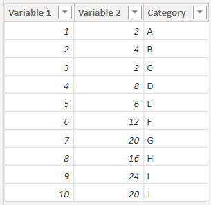
Sample data
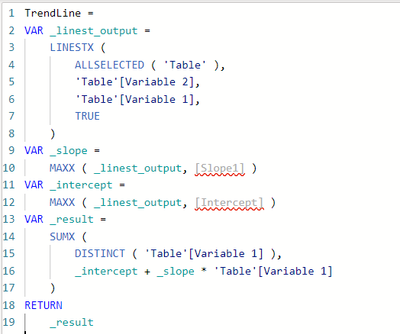
Below is the trend line measure
TrendLine =
VAR _linest_output =
    LINESTX (
        ALLSELECTED ( 'Table' ),
        'Table'[Variable 2],
        'Table'[Variable 1],
        TRUE
    )
VAR _slope =
    MAXX ( _linest_output, [Slope1] )
VAR _intercept =
    MAXX ( _linest_output, [Intercept] )
VAR _result =
    SUMX (
        DISTINCT ( 'Table'[Variable 1] ),
        _intercept + _slope * 'Table'[Variable 1]
    )
RETURN
    _result
You may notice an error indication in the variables _slope and _intercept.
But you can ignore it. Hope it will be resolved in the upcoming Power BI update. Anyway, the measure will work as expected.
Next, we need to create a measure for conditional formatting.
Below is the sample measure.
Color =
IF ( SUM ( 'Table'[Variable 2] ) > [TrendLine], "Red", "Green" )
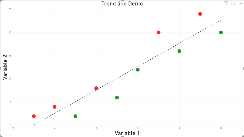
You can customize the logic based on your need. Here we are just coloring the bubble as red if the Y axis value is higher than trend line, else color will be green.
Now you can use scatter chart from the visualization pane. In this example, you can use [Variable 1] column into X axis, [Variable 2] into Y axis and [Category] column into Values.
If you use Legend property, conditional formatting will not work.
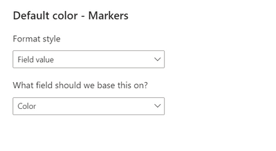
Next you can navigate to visual formating pane. Under Markers option, you can click on fx icon near to color section.
Then you can select Format style as Field value, select newly created measure (Color) in What field should we base this on? and click ok.
Then you will get the result as below.
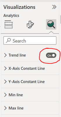
To enable the trend line in the scatter chart, you can navigate into analytics pane and turn on trend line.
Hope this blog is helpful 😊. Let me know your suggestions/feedbacks.
Regards,
Nandu Krishna



Be the first to comment