

Learning Chart design best practices can help you accurately interpret data. Read on for questions to ask and chart design best practices to consider while reviewing charts.
Is the chart the right type for the data being presented?
To understand the right chart type for the data being presented, we need to consider quantitative and qualitative variables.
Quantitative variables can be measured numerically. Examples of quantitative variables are number of items in a set or height in inches. When displayed on an axis, quantitative variables will have scales with even intervals (0, 5, 10, and so on).
Qualitative variables can’t be measured numerically. Examples of qualitative variables are favorite food, movie genre, or Sales region. When displaying qualitative variables, the axis will show categories instead of scales with even intervals.
To learn in more detail about types of variables, check out the Variables and Field Types module in Trailhead and Tableau’s help article on Data Structure.
There are different chart types appropriate for the type of data being presented. Some common chart types appropriate for qualitative variables include bar charts and pie charts. Some common chart types appropriate for quantitative variables include scatterplots, line charts, histograms, box and whisker plots, and bar charts.
Watch out for charts that use types of charts not meant for the type of data being presented. For example, you may encounter line charts, which are meant for showing quantitative data, used with qualitative data—as shown in the inappropriate line chart below. The line chart makes it appear that there are even intervals between categories. When we study the axis, we discover categories of sectors (Agriculture, Arts, Clothing, and so on) are numeric and do not have equal intervals and it would not make any sense to connect them with the line. A bar chart would be the better alternative.
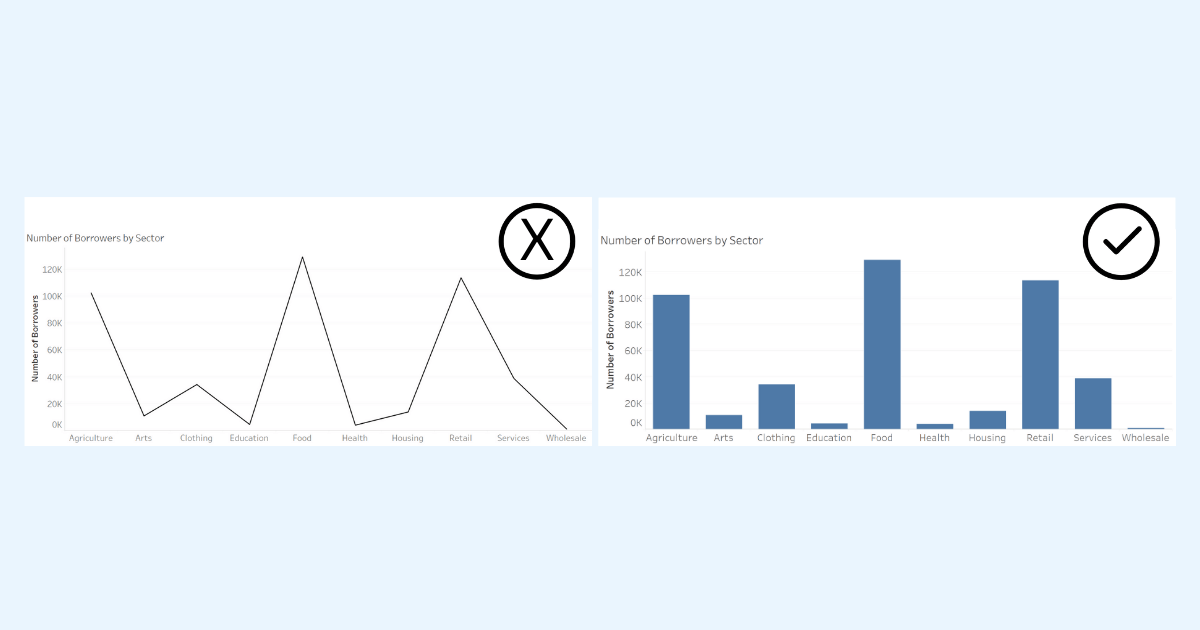 Inappropriate line chart (left) using a qualitative axis and an appropriate alternative bar chart (right).
Are there any misleading design practices used in the chart that might deceive or distract you from correctly interpreting the data?
While creative and intriguing designs can be eye-catching, some can distract from properly communicating important insights in the data.
For example, while pictograms that use symbols and images to convey information may add visual appeal, when they don’t follow best practices, they may mislead viewers—particularly when used to display size differences. This is evident in the following pictogram below, where you’re misled into seeing a much larger difference between the two categories than what actually exists.
The underlying data is that A is 100 and B is 300. Viewers are more likely to interpret the area between A and B in the chart on the left rather than height as the difference in chart 1. between A and B. Using area in this pictogram misleads us into thinking there is a 9-fold difference instead of the correct 3-fold difference. This pictogram violates the Principle of Proportional Ink described by Carl Bergstrom and Javin West at the University of Washington: when a shaded region is used to represent a numerical value, the area of that shaded region should be directly proportional to the corresponding value.
 Two pictogram charts: the pictogram on the left showcases two smiley faces, a smaller “A”, and larger “B”. The pictogram on the right showcases the same “A” and “B” but also includes how many smaller “A” smiley faces would make up the larger “B”. While value B is only 3 fold more than A, the larger smiley faces lead the reader to see a 9 fold difference instead.
Take the Guidelines to Recognize Misleading Charts Trailhead where we cover more design practices to watch for.
Be the first to comment