

Welcome back to this week’s edition of the Power BI blog series. This week, we explore dynamic legends.
In the world of data, making sense of
information can be tough. We often use
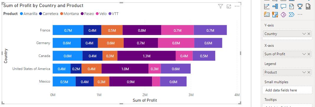
charts and graphs to help us understand things better. In the following Stacked Bar chart, we have
plotted total profits against countries and we use products as the legend to
further break down the data. This is
cool, right? But what if we could take
this chart to the next level?
What if, besides product categories, you
also want to break down the data by business segments or years of sales? The visualisation only allows one [1] choice
of legend, but it is unnecessarily cumbersome to plot total profits multiple
times just to show different legends. What
if we tell you, that you can easily switch between legends in the same plot by
clicking a button?
Well, that’s what we are going to learn
about in this article. Throughout this
article, we will be using the Financials sample dataset in Power BI
Desktop, and you can download our demonstration file with this link.
Helper Table, Measures
and Dynamic Legends
To be able to use different fields as
legends in one visualisation, we first create a one-column helper table, stacking
unique values of the fields that we want to use as legends. For instance, here we will choose the fields Year, Product and Segment, and we go to Table view -> New table and enter in the Formula bar:
Helper
= UNION(ALL(Financials[Year]), ALL(Financials[Product]), ALL(Financials[Segment]))
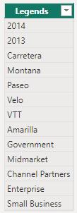
The resulting table will be a list of
unique values from Year, Product and Segment, where we
have named the column as Legends:
Then, instead of the original field Profit from table Financials, we will define “legend-ed” profit measures by
intersecting with the Helper table.
For example, we define a measure Profit by Product as:
Profit
by Product = CALCULATE(SUM(Financials[Profit])
INTERSECT(VALUES(Financials[Product]), VALUES(Helper[Legends])))
This way, intersecting unique values of Financials[Product] with our Helper table not only breaks up total profits by Product, but also links the measure to our Helper table. This is the key to activating dynamic legends. For this example, we will similarly define Profit
by Segment and Profit by Year:
Profit
by Segment = CALCULATE(SUM(Financials[Profit])
INTERSECT(VALUES(Financials[Segment]), VALUES(Helper[Legends])))
Profit
by Year = CALCULATE(SUM(Financials[Profit])
INTERSECT(VALUES(Financials[Year]), VALUES(Helper[Legends])))
Note that INTERSECT is datatype-sensitive, which means for the field Year here, we need to change
it to text to be consistent with the Helper table.
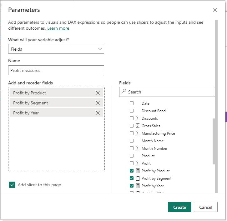
Next, we will group these measures together
by defining a parameter: Report view -> Modelling -> New parameter
-> Fields.
Then, we may plot the Stacked Bar chart
again with the parameter Profit measures as the x-axis, and Legends from our Helper table as the legend.
We can add a slicer for Profit measures to enable optional
legends, and we specify the slicer as a ‘Single’ selection to ensure
that one of the legends is displayed, by using Visualisations -> Format visual
-> Visual -> Slicer settings -> Selection -> Single select.
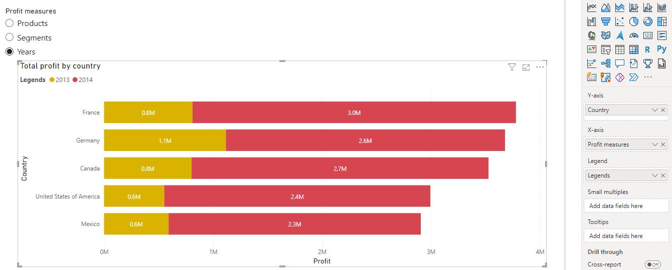
Now, for the plot total profit against
countries, we can choose a legend from Year, Product or Segment by clicking buttons in the slicer.
More to the
Technique
We can extend the technique of specifying the
legend: we can also include different measures in the same
visualisation.
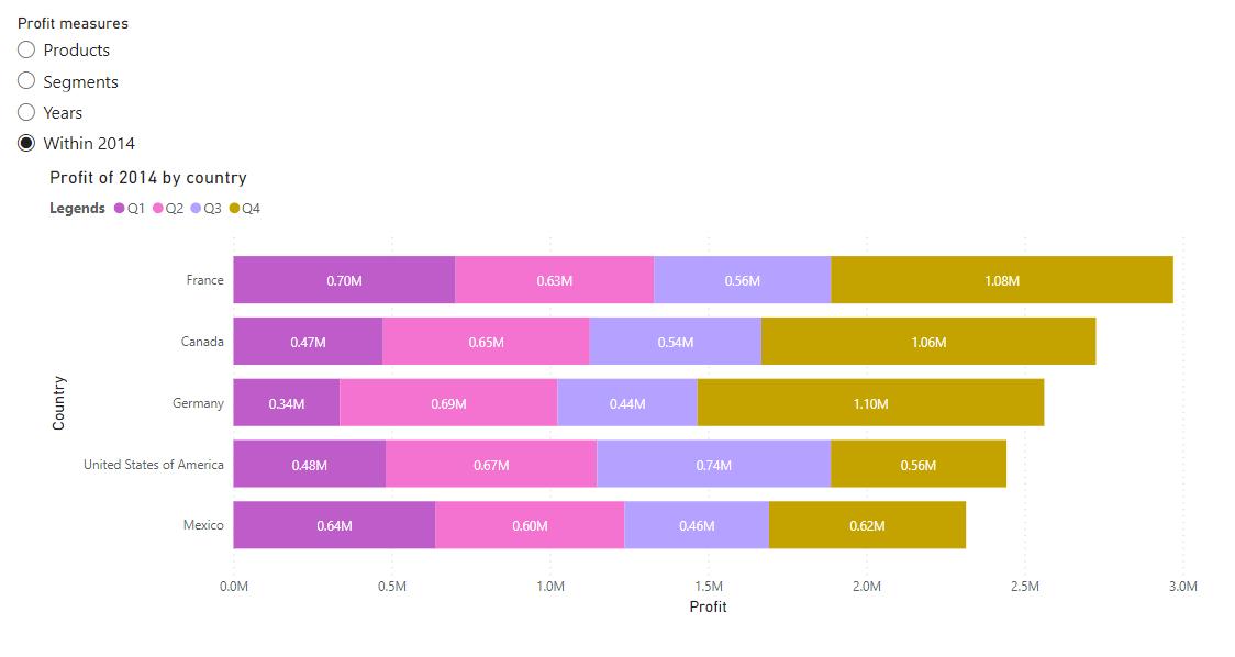
For example, we can look at the profits of
2014 with quarters as the legend. First,
we need to include Quarter in our legend, by updating the Helper table:
Helper
= UNION(ALL(Financials[Year]), ALL(Financials[Product]), ALL(Financials[Segment]),
ALL(Financials[Quarter]))
Then we can define a measure for profits in
2014:
Profit
in 2014 = CALCULATE(SUM(Financials[Profit]), Financials[Year]=”2014″,
INTERSECT(VALUES(Financials[Quarter]), VALUES(Helper[Legends])))
and add it to the parameter Profit
measures:
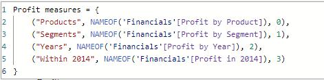
Here, we added the new measure Profit in
2014 into the parameter Profit measures by first selecting it, and
then editing the DAX expression in the formula bar. The DAX syntax for a parameter is as follows:
Parameter
= {(“friendly name”, NAMEOF(‘table'[measure]), order), …}
Inside the curly brackets ({}), we
use one [1] pair of brackets for one [1] measure. For each measure, the first argument is a
friendly name to be specified, the second argument is the exact measure name,
and the third argument is the order of that measure in the parameter, starting
from zero [0].
After adding a measure into Profit
measures, our slicer with legend options will update automatically. We now have a new measure in the same
visualisation, the profit of 2014 broken down by quarters:
Be the first to comment