
First, we create a new visual using PowerShell and open Visual Studio:
pbiviz new KPICard_Tutorial
cd kPICardTutorial
start devenv .
See commit for the newly created files.
We create the Power BI File with some Sample Data.
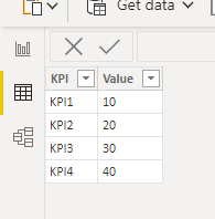
We publish the Power BI file to the cloud and start the server (using PowerShell).
pbiviz start
We add the custom visual (‘</>’) and press the reload button (triangle).
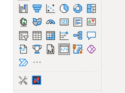
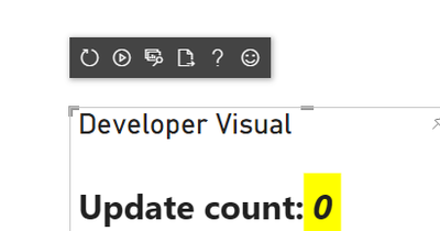
We start to make changes in visual.ts and once we save the file, we can directly see the impact on the visual running on the web.

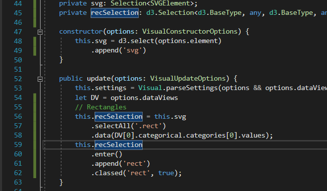
First, we remove all the lines in the constructor and most of them in the update function. See results here. The code and debugger results look like this:
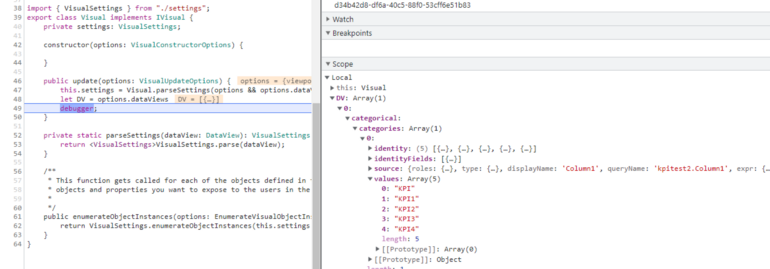
We will now add a rectangle for each KPI. We will do this in a very stripped-down manner, so without any nice typed containers as described in the official documentation, to keep this as straightforward as possible.
First, we add a svg element using D3 (see commit)
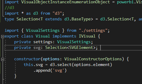
When we right-click on our visual and select ‘inspect’, we see that the SVG element has been created.

Add rectangle per KPI
Next, we create a rect element per KPI using D3, see commit and illustration below.
In line 58, we directly mapped our Power BI data to the data property of our rectangles by copying the path to the value from the inspector:

Add ‘console.log(options)’ in the update function, open DevTools (or equivalent) to access the options object.
As a result, we see that the rect elements have been created:
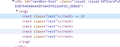
After updating the visual the number of rect elements stays the same, so D3 is properly mapping the elements to the provided dataset (thanks to the class attribute).
Add content and attributes to the rectangles
To set the x position dynamically, we add an index to the list of values to help determine the x position. We also add width and height and styling attributes to ensure our squares become visible.
We also need to make sure the SVG element’s width is equal to the viewport width.
The code looks like this:
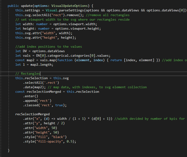
See code changes here, please note our dataset is now called ‘map2’.
The result is that the squares will now automatically evenly distribute over the width of the viewport width (with each update of the visual).

Add selections / Interactivity
We will now add selections interaction which looks like this:

So, selecting a rectangle results in interaction with other dashboard elements.
To add selections interaction, we need to retreive selectionId’s, add these to the dataset and add the function call ‘this.selectionManager.select()’ to the on click event of a square. See changes in this commit. Primarily, the changes revolve around making the host and selectionmanager available in the visual class instance. So the selectionManager.select() call can be made on a ‘click’ event.
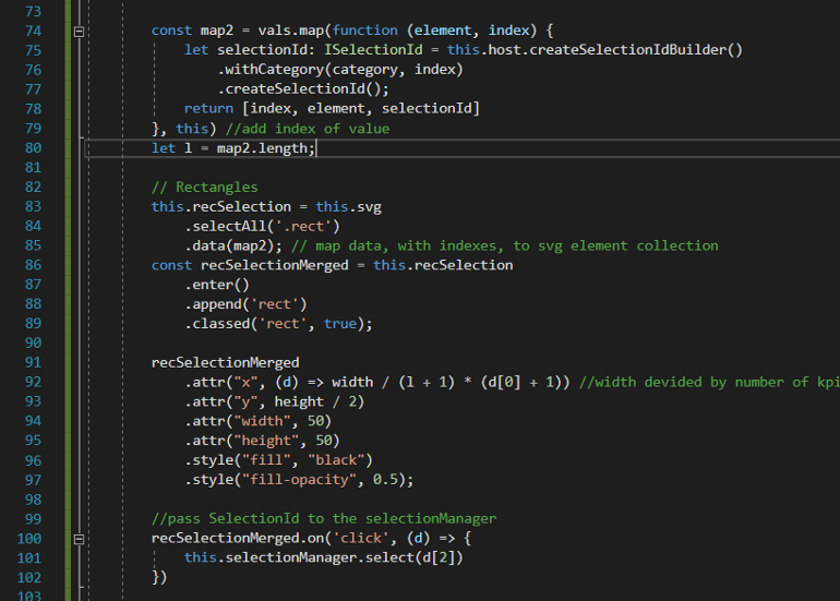
For more info, see this article on selections.
Add highlighting
To visually emphasize the square selected we use the SelectionId of the currently selected element to highlight that one, the remainder will be very light. In case of no selection, the squares will be dark. The result looks like this:

We only added a few lines, again in a very stripped-down manner, just to understand the core mechanisms at work. See commit here.
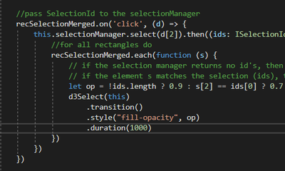
‘selectionManager.select’ returns the id’s of the selected elements. recSelectionMerged contains all the KPI elements. We compare id’s, when its a match we assign a different opacity to the element.
Adding formatting options
We will now add color pickers to the Visualization pane, which looks like this:
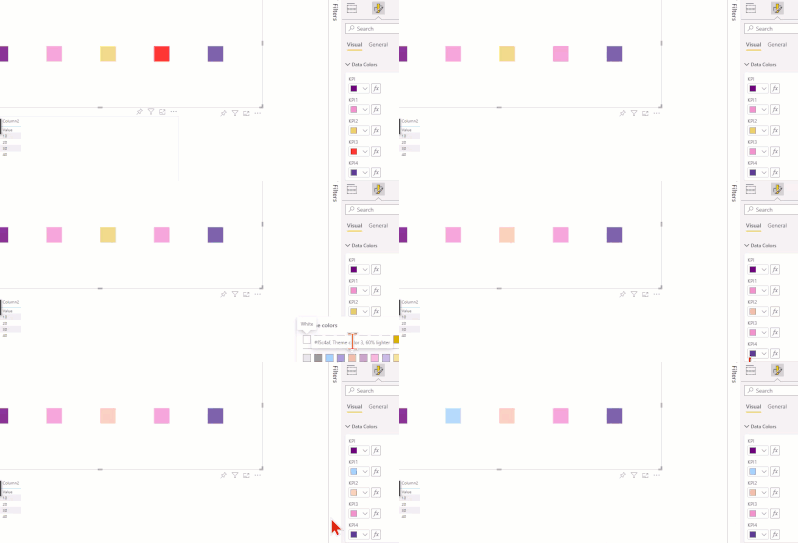
We need to make sure powerbi-visuals-utils-dataviewutils has the latest version so we can import dataViewWildcard. For this, we might need to, update, upgrade and ‘npm’ install ‘powerbi-visuals-utils-dataviewutils’. See here for all the needed dependencies (that can be installed via NPM).
import { dataViewWildcard } from "powerbi-visuals-utils-dataviewutils";
The most important part of the code change is the modification the enumerateObjectInstances, to ensure the formatting pane is populated with our KPI’s. Therefore, we iterate this.map2
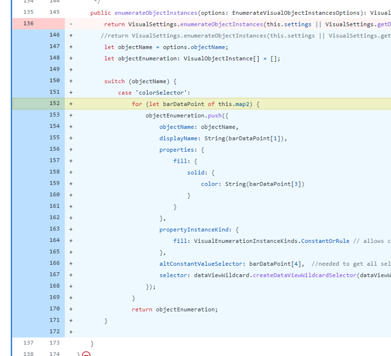
Please note line 166, the selector, this basically holds the index position of the KPI to link this formatting option to the right KPI (it seems..). This is the content of the selector.

Once a color is selected, it adds a property to the dataViews object. Before any color selection DataViews looks like this:
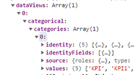
After a color has been selected the dataViews looks like this:
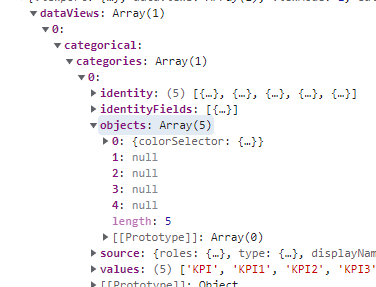
The objects property has been added and contains the selected colour.
Therefore, we add this code to check for the ‘objects’ property and then assign the color to our dataset, if present.
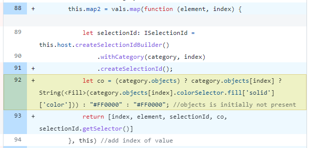
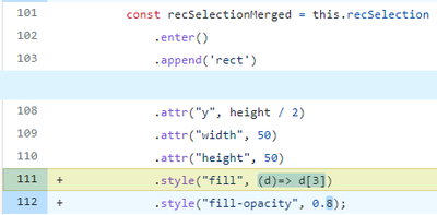
This allows us to set the selected fill color here.
Add Highlighting
Finally, we add highlighting. This allows interaction from other visuals to our visual. The result looks like this:
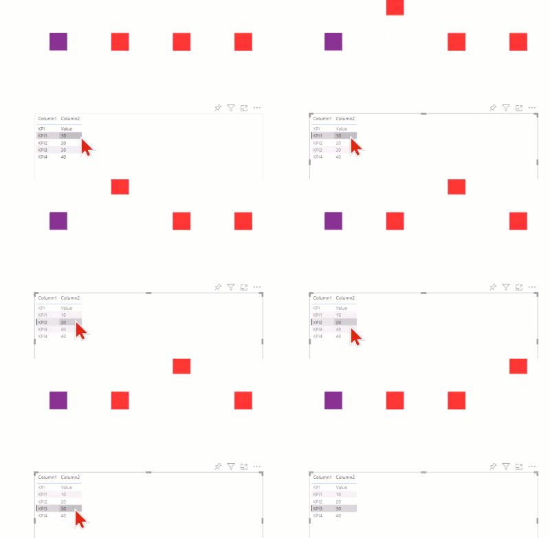
Firstly, we need to enable highlights in the capabilities file.
Secondly, we need to make sure we use measure values.
Thirdly, we need to check for the presence of the highlight property and then use it to change the y position of the element (being evaluated).
The same applies here, before any selection is made, there is no highlight property, after a selection, its added to the measure values property:
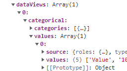 Before selection
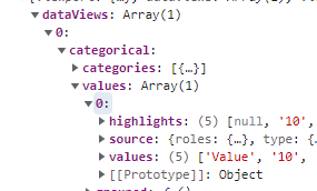 After selection
Hopefully, this article helped you get an understanding of the core mechanics that are used in Custom Visuals in a focused manner. This article is a repost from a Medium article, I am the original author.

Be the first to comment